
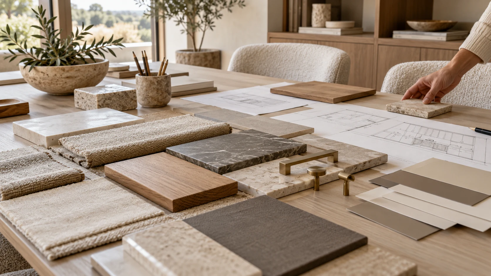
In material board interior design, the board is a curated set of the finishes, colors and materials planned for a space, presented as physical samples, digital images or both before anything is ordered. A mood board establishes atmosphere and direction; a material board brings that direction down to particular surfaces. Many designers combine the two in the same presentation.
The useful question is what the client can decide from what you show. A paint sample can settle a color while leaving the final sheen open. A sharp woodgrain image can communicate the right character while showing the pattern at the wrong size. A good board makes those limits visible alongside the design.
What is a material board in interior design?
A material board shows the surfaces you intend to put together in a room, so their color, texture and finish can be considered as a group. It connects a broad idea such as a warm, quiet interior to the actual wall, cabinet, stone, fabric and metal selections that create it.
The names overlap in practice. What matters is whether everyone understands the decision being made from that particular board.
| Presentation | What it shows | When it helps | What remains to be resolved |
|---|---|---|---|
| Mood board | Atmosphere, references and a color direction | Early agreement on how the room should feel | Particular products and final surfaces |
| Material board | Selected materials and their relationships | Comparing the proposed room palette | Any unrepresented finish, scale or construction detail |
| Formal sample submittal | The specified sample submitted for project review | Checking a proposed selection against project requirements | Matters outside the submitted sample and review scope |
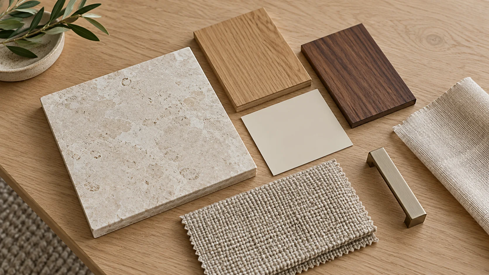
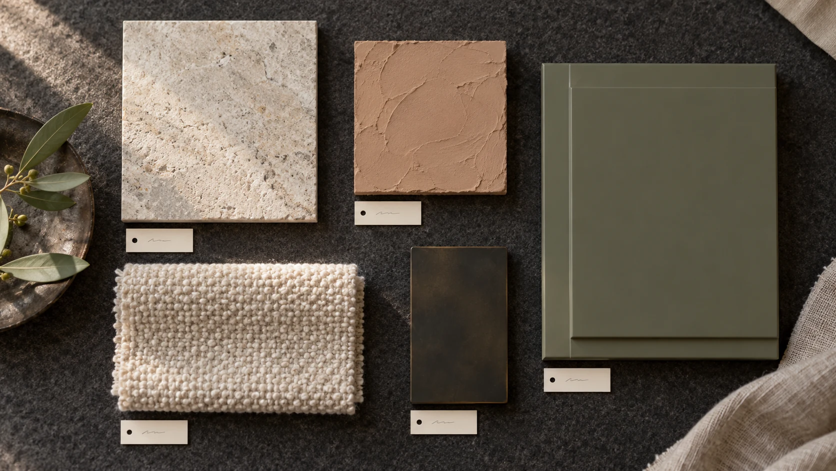
For a living room, the material board can show how the cabinet face sits beside the upholstery and wall color. The inspiration image explains the atmosphere; the samples let the client consider those particular surfaces together. The board is most useful when you can point to each piece and explain where it will appear in the room.
What should go on a material board?
The main room surfaces, supporting textiles, hardware finishes, lighting references and a short explanation of the design should all be represented. Start with what occupies the most visible space: floor, walls, cabinetry and any substantial stone or work surface. Then add the smaller materials that meet them.
Give each sample a name or reference that can lead back to its source, together with its actual surface description. “Warm white” conveys an impression; a named color with the sample’s sheen tells the reader what is physically on the board. Identify the selected weave on a fabric image so the pictured material can be found again.
A brief can be a plain sentence about the room’s purpose and desired character. Follow it with a short reason for the material choices. In a reception space, that might explain why a restrained wall finish supports a more expressive desk face. In a bedroom, it might explain why the cabinetry and fabric share a quiet tonal range.
Include the metal finish early if it meets the main surfaces. A small handle, trim or light fitting can introduce a reflection that a palette of flat color swatches leaves out. Keep a room reference where it helps someone understand the whole scheme, and identify aspirational images separately from the materials you have selected.
How do you arrange a material board so it reads clearly?
Group the board around the decisions the client needs to understand, and give large room surfaces more visual weight than small accents. The arrangement should explain the proposed room rather than give every sample an equal square.
Place materials that meet in the finished space beside one another. A cabinet face, its neighboring wall and its handle finish make a useful group. A floor sample placed far from the joinery it touches makes that relationship harder to judge. For an open interior, separate the room groups while retaining the common material that connects them.
Keep the brief and explanation easy to find. Someone who joins the meeting late should be able to follow why the stone is prominent and the metal is a small accent. Avoid a fixed percentage formula: the useful hierarchy follows the actual room and the design decision under discussion.
If the same material appears in several places, show that connection with a clear note or a simple elevation. You can keep alternative selections nearby during development, then present a clearly identified preferred scheme. This lets the client respond to a coherent proposal while you retain the alternatives for a particular unresolved choice.
Should a material board be physical or digital?
Physical and digital boards usually work well together: the digital version explains and shares the scheme, while the physical samples let people examine texture and sheen. Choose the balance around the meeting and the decisions still open.
A digital board is convenient for remote discussions and revisions. You can show the room reference, group materials by location and keep the explanation with the images. A physical tray brings the actual fabric, stone and surface samples to the table. It is especially useful when the client is choosing between finishes that look similar in a small photograph.
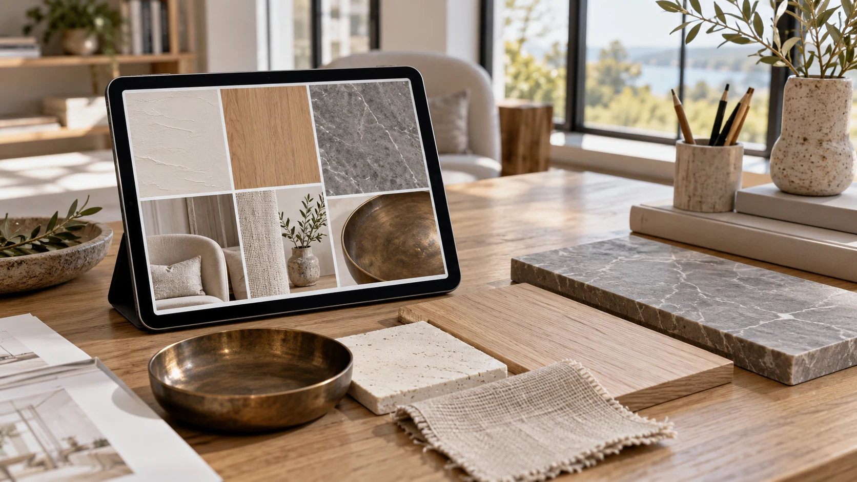
For a remote presentation, send the digital board in a format the client can open easily. Identify which physical samples they have received, so both sides discuss the same selection. At an in-person review, use the digital elevation to explain location, then bring the relevant sample group forward for the material decision.
The software matters less than legibility, revision control and the ability to connect an image to its source. A polished layout still needs the following checks before it can stand in for the intended finished room.
Does a physical sample show the finish you specified?
Not always: a physical sample may represent the color while leaving the final product and sheen unconfirmed. Benjamin Moore’s US 8 oz. color sample, product 0200, provides a concrete example. Its official product page specifies an eggshell finish and says the sample is intended for paint color representation only. This applies to that particular sample product. Product details, checked October 2026.
If the proposed wall will be matte, the eggshell sample beside a polished stone or metal piece shows a different surface relationship from the final specification. The color decision and the surface decision can therefore reach completion at different times.
Our suggested board method is to label the sample with its actual sheen and record the planned final product and sheen beside it. If reflections between neighboring materials affect the scheme, add a sample made with that final product and surface before closing that decision.
Changing light introduces a further issue, explained in our metamerism and color-matching article. First establish which surface the sample represents; then evaluate it in the light that matters to the room.
Is the pattern shown at its real size?
A clear image can still show a wood or stone pattern at the wrong physical size when it is placed on an elevation. In modeling software, image resolution and the size assigned to the material are separate matters.
SketchUp’s material editor lets users change a texture tile’s size, preserves its aspect ratio by default and allows that ratio to be distorted. The official documentation was updated September 29, 2026. Adobe’s material documentation, updated October 8, 2026, likewise identifies physical size as a separate property defining real size. Material editing, physical size.
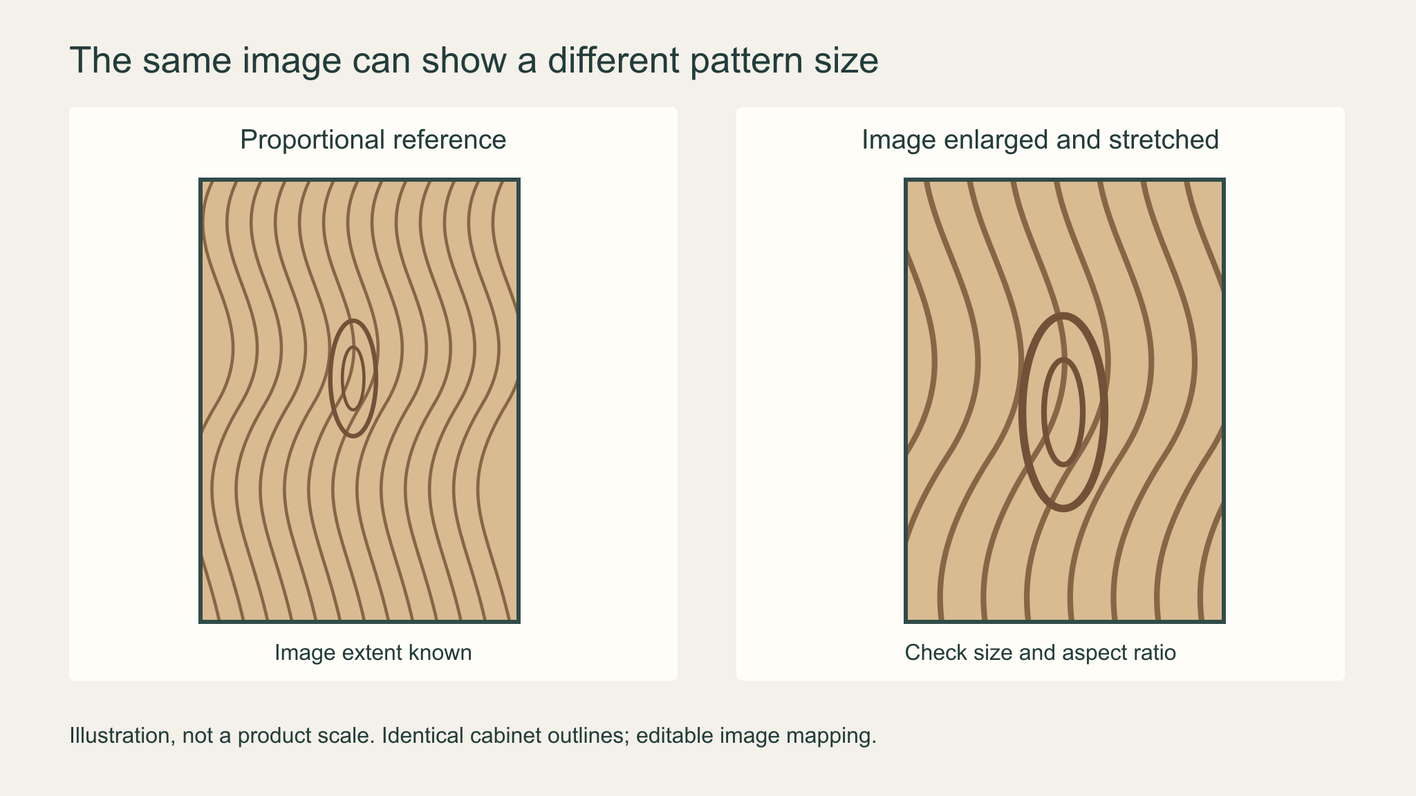
For design review, establish the actual width and height represented by the source image, its orientation and the portion of material it shows. Use that information when mapping it onto the cabinet or wall elevation. If the physical extent is unknown, label it “pattern detail only; scale unconfirmed.”
Check a prominent knot or stone vein against a physical sample or a wider supplier image before asking the client to approve its size in the room. Actual panel direction and continuity are a further decision covered in grain matching for cabinets.
How do you present a material board to a client?
Explain the brief first, walk through the materials in their room locations, and finish by stating the particular decisions you want the client to make. The explanation should connect the board to how the room will be used.
Start with the overall direction, then move through the dominant surfaces and the smaller details that meet them. Let the client see the wall beside the cabinet face before discussing a handle in isolation. Read the short rationale in ordinary language, especially where a selection answers a practical room requirement.
Make the outcome specific. Record whether the client agreed to the color direction, the actual finish selection or only the general material character. A drawing can show the intended woodgrain orientation while its physical scale is still awaiting confirmation. A real paint sample can settle color while the final surface sample is still to come.
These are suggested presentation records, separate from the project’s formal millwork submittal process. Keep the agreed board identifiable when it is shared after the meeting, and put outstanding decisions beside the relevant material. The next person opening the file should see what needs resolution without reconstructing the conversation.
Where do silicone-faced film samples fit on a material board?
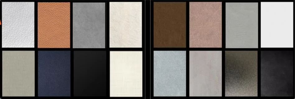
Puremorfilm makes decorative film with a silicone functional surface for flat furniture and wall-panel faces. Our furniture decorative film can be considered alongside the other surfaces on your board, using actual samples to judge the selected color and texture.
The silicone surface is inherently flame-retardant; higher grades up to UL 94 V-0 are available on request. In the manufacturer’s laboratory tests, coffee, red wine and soy sauce remained at 25°C for 24 hours before wiping, with no obvious change afterward. We use a No DOP formulation.
We offer more than 100 patterns, with texture and gloss customization available. Samples are free, and the minimum order is 500 linear metres for film or 200 panels at 1220 × 2440 mm for laminated panels; a proposed custom sheen needs its own sample confirmation. We mainly supply rolls for PUR flat lamination, with laminated panels available on request.
Is your material board ready to present?
Your board is ready when the room direction is clear and each sample or image can support the decision you are asking the client to make. Use a digital board for explanation and sharing, and bring physical samples where surface feel or reflection affects the choice.
| Before the meeting | What should be clear |
|---|---|
| Brief and rationale | What the room needs and why these materials fit |
| Material hierarchy | Which surfaces dominate and which are accents |
| Sample identification | Source, reference and actual surface shown |
| Paint or color sample | Its present sheen and the planned final finish |
| Pattern on an elevation | Confirmed physical extent, or a visible scale-unconfirmed note |
| Meeting outcome | The decisions being requested and what remains open |
Our new paint-free material uses a silicone functional face, distinct from PVC, melamine, PP and PETG decorative faces. We can provide samples for the surface selections you want to examine. With your project use, desired pattern or texture direction and sample needs, contact us.
Frequently Asked Questions
What is a mood board for interior design?
A mood board is a visual proposal for a room’s atmosphere and direction. When it includes particular finishes and material samples, it also helps explain how that direction will become a room.
What are some good mood board apps?
Layout apps, digital whiteboards and tablet presentation tools are useful options for assembling and sharing a board. A modeling tool helps when the decision requires placing a material at a known physical scale on a room surface.
What should I include in an interior design mood board?
An interior design mood board should include the room direction, a coordinated palette, material references and the furniture or lighting that explains the proposal. Add a short reason for the choices so the client knows what they are approving.
Should I make a digital or physical mood board?
No single format covers both easy remote sharing and tactile review equally well; a digital board with corresponding physical samples covers both tasks. Bring the actual surface when texture or sheen is part of the decision.
What is the difference between a mood board and a concept board?
A mood board emphasizes atmosphere, while a concept board usually makes the spatial idea and reasons for the choices more explicit. The terms overlap, so state what you want the client to decide from the presentation.