
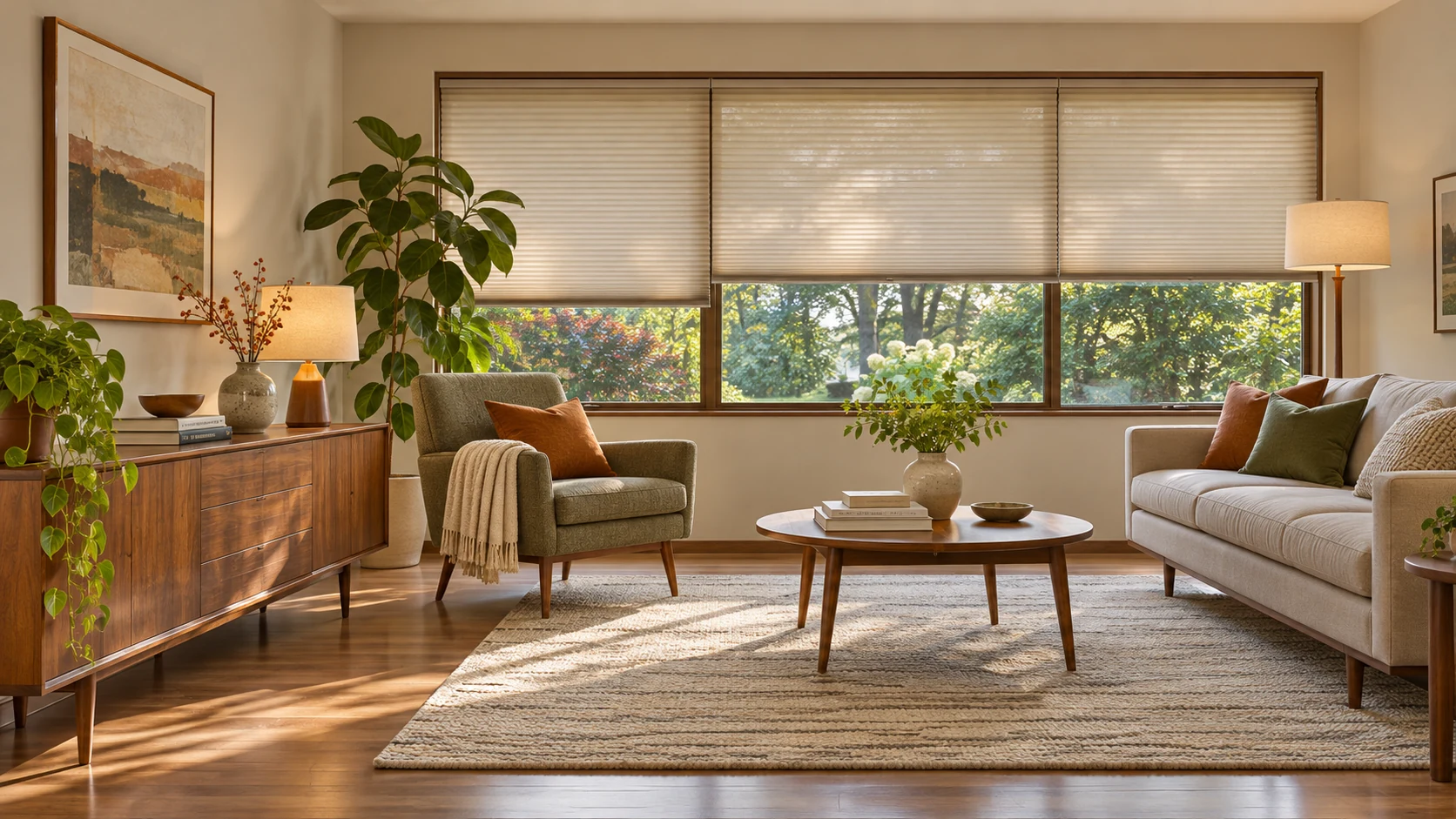
Mid century modern interior design combines clean lines, organic curves, low furniture on slender legs, warm wood and a restrained base with brighter accents. It is usually associated with homes of roughly the mid-1940s through the 1960s, although some accounts trace its beginnings to the 1930s. To use it today, let a strong furniture piece lead, keep the layout open and protect wood finishes from direct sun.
What is mid century modern interior design?
Mid century modern interior design is a domestic design vocabulary that pairs useful, uncluttered forms with a more organic sense of shape. The room is a combination of furniture, textiles, lighting and everyday objects, rather than a collection of tapered legs.
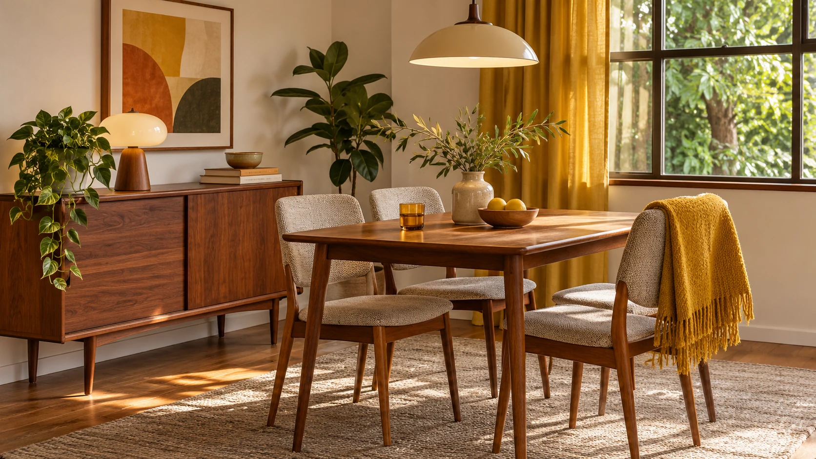
Its dates have soft edges. Style guides often place the main period from the mid-1940s to the late 1960s; broader accounts start in the 1930s. Designer work, production dates and later revivals overlap, so a precise start year is less useful than understanding the forms and materials.
Design historian Penny Sparke describes the style as best understood through ensembles. Her historical account places its sustained revival from the 1990s onward and notes that today’s use of the term includes a wider range of later designs. A room can therefore use a contemporary chair with the right proportions without pretending it is an original period object.
The style’s interest in function is visible in clear surfaces, accessible storage and furniture that leaves space around it. Warm timber, textiles and curved shapes keep those simple arrangements from feeling bare. Choose the combination for daily life, then decide how closely you want to follow a particular period.
Where did mid-century modern design come from?
It developed through related design work in Scandinavia, Italy, the United States and Britain, with different emphases in each place. The postwar home was a major setting for lighter furniture, new materials and less formal living.
Scandinavian work brought wood craftsmanship and everyday usefulness into a modern vocabulary. Italian design included a more sculptural and fashion-conscious direction. American interiors connected modern furniture with open living and, in many houses, a closer relationship between indoors and outdoors. Britain’s related work was often called Contemporary Style.
The Designmuseum Danmark account of Danish Modern explains the reaction against earlier living rooms crowded with heavy furniture, textiles and ornaments. It also shows how designers studied historical chair types rather than abandoning the past altogether. Simplicity grew through selection and redesign.
MoMA’s account of Good Design documents its exhibitions from the late 1930s through the 1950s, bringing attention to useful and aesthetically considered contemporary products. Good Design is a particular museum program, not another name for every mid-century interior, but it helps explain the era’s interest in everyday objects.
Select the main furniture before the decorative objects. An open-backed chair, useful cabinet and considered lamp can establish the direction. You can leave the decorative objects until those everyday pieces work together.
What are the key features of a mid-century modern room?
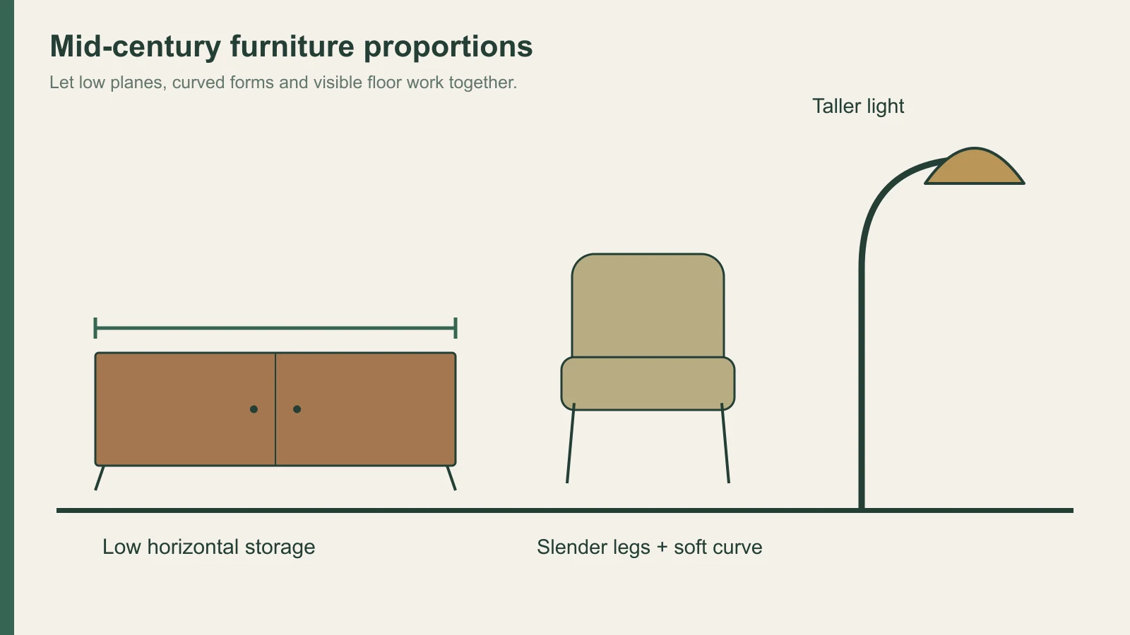
Clean lines, curved forms, raised furniture and a limited number of expressive objects are the main visual cues. Natural and manufactured materials often sit together in the same room.
| Feature | What it contributes | A common mistake |
|---|---|---|
| Low, horizontal furniture | Long sightlines and a calmer wall composition | Choosing a cabinet too deep for the room |
| Slender or tapered legs | Visible floor beneath the furniture | Buying the silhouette without checking sitting comfort |
| Organic curves | Softer shapes beside straight planes | Filling the room with competing sculptural pieces |
| Warm wood | A repeated material and color reference | Expecting all woods with the same species name to match |
| Bright accents | Color in a chair, rug, art or small object | Giving every large piece a different strong color |
| Uncluttered surfaces | Clearer furniture forms and usable space | Removing all personal objects and making the room feel empty |
A low cabinet and a taller lamp can provide a useful contrast in height. A curved chair can soften a straight sofa. Let these relationships do some of the decorative work before adding more patterns.
The furniture should fit how you sit and move. A low sofa may look right but be awkward for someone who finds it difficult to stand from a low seat. A light-looking dining chair still needs to be comfortable at your table. The silhouette is one part of the choice.
Leave floor visible between major pieces. This gives slender legs and lower profiles room to read. If the room needs substantial storage, a coherent cabinet run may be calmer than several small cabinets competing with the seating.
Which materials and woods define the style?
Warm wood, molded plywood, plastic, metal, rattan, leather and woven textiles are all part of the style’s vocabulary. The contrast between materials is as useful as any single species.
| Material | Typical role | A current selection question |
|---|---|---|
| Teak- or walnut-toned wood | Cabinets, tables and furniture frames | Is the proposed face solid wood, veneer or a reproduced pattern? |
| Molded plywood | Curved seats and shells | Does the complete chair support comfortable use? |
| Plastic | Chairs, lamps and small objects | What is the condition of an older piece, including visible cracks? |
| Metal | Legs, frames and light fittings | Does the finish sit comfortably beside the room’s wood tone? |
| Rattan and woven material | Seats and lighter textured elements | How much texture does the furniture group already have? |
| Leather and upholstery | Seating and soft contrast | Is the color and feel right for the room’s daily use? |
Veneer can provide a real wood face across a cabinet’s broad planes. Solid wood may be used for legs or frames, while plywood can form a curved shell. These constructions can coexist; the wood veneer versus solid wood guide explains the difference.
Choose the wood tone using the furniture that will remain in the room. A new pale cabinet does not have to copy a dark vintage table, but they need a visible relationship through warmth, grain or the surrounding colors. The guide to gloss measurement helps you describe their sheen as a separate choice. A small chip beside a photograph rarely resolves that decision.
For a flat-faced built-in, compare real veneer with other decorative faces by their actual structure and intended use. The wood veneer versus laminate comparison is a separate material decision from whether the furniture’s form fits the room.
Which colors suit a mid-century modern interior?
White, cream, beige and other quiet large surfaces can support mustard, orange, teal, blue, green or a darker accent. Warm wood often acts as the repeated color linking the furniture.
Start with the largest items you will keep. A brown cabinet and a neutral sofa may already supply the room’s base. A mustard chair or teal textile can then be a deliberate accent instead of another unrelated purchase.
A brighter room can carry an off-white wall and a saturated chair. A darker scheme can use charcoal or a deep color, with wood and lighter upholstery helping the furniture remain distinct. Neither direction requires every object to be a period color.
Patterns work best when their scale has a role. A large graphic rug can organize a seating group; a small patterned cushion can provide a quieter reference. If the art and rug are both strong, let the upholstery be simpler.
The interior design color palette guide explains how to compare the group in its actual lighting. Include the existing floor: it may be the largest wood-colored surface in the room and can change how a new cabinet looks beside it.
How should you plan the layout, windows and light?
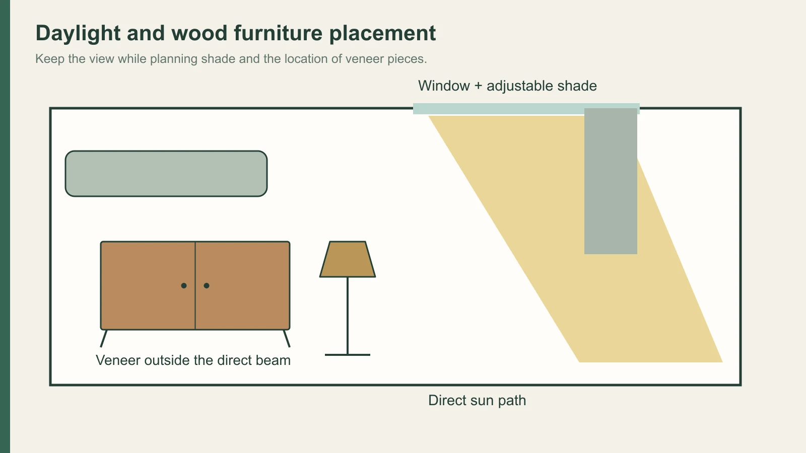
Keep routes and sightlines open, use lower furniture where it preserves a view, and balance daylight with protection for wood. The familiar advice to leave windows visually clear needs a practical adjustment when sunlight reaches veneer furniture.
Put the main seating where it supports conversation, reading or the view you use most. A low cabinet beneath artwork can be a better partner for the seating than a tall wall of unrelated shelves. Let a rug define the group without closing the route around it.
Layer the artificial light. A pendant can organize a dining area, a floor lamp can serve a chair, and a wall light can give a quieter evening option. Several useful points of light suit a room with distinct activities better than expecting one bright ceiling fitting to serve everything.
For wood, the Timber Veneer Association of Australia’s care guidance advises avoiding direct sunlight on interior veneered surfaces. Natural and artificial light can change the wood’s color, and conventional coatings may yellow with age. Low-yellowing finishes can be specified for new work.
Use adjustable shading during the strongest sun, or position a valued veneered cabinet outside the direct beam. A light curtain can preserve the window’s visual softness, but check whether it actually keeps the sun off the furniture. Open views and wood protection can be planned together.
Do not judge the palette only at midday. A wood face that looks golden in daylight may read more orange under the evening lamp. Choose the light source during the material review, not after everything else has been bought.
How do you mix vintage, replica and new pieces?
Let one distinctive piece set the direction, then choose the remaining furniture for proportion, color and use. Original period work, authorized reproductions and new designs offer different routes to that result.
| Route | What it brings | What to inspect |
|---|---|---|
| Original period piece | Actual age, construction and wear | Condition, repairs and suitability for use |
| Authorized reproduction | A continuing interpretation of a known design | Authentic supply information, dimensions and finish options |
| New design with related forms | A contemporary component without the need for period authenticity | Comfort, proportions and how it works with the existing pieces |
An older cabinet may have changed color, and a plastic shell may have damage that is difficult to repair. See the actual object or obtain enough condition information to make a decision. A period label does not resolve the component’s current usefulness.
Mixing wood tones is easier when you aim for coordination. Under ANSI/AWI 0642–2024’s transparent-finished wood-paneling provisions, adjacent veneer and solid wood are described as well matched at Premium grade and compatible at Custom grade. Those are professional paneling requirements, not a rule governing your vintage chair; they illustrate why “same species” and “identical appearance” are different requests.
For new cabinet faces, plan the grain matching across doors and drawers. Keep a sample beside the vintage piece on your interior material board, including the planned coating or decorative face.
Give each major piece enough space. A room full of individually attractive period objects can still feel crowded. Keep the pieces that support the layout and leave a surface for the things you use every day.
Where does silicone-faced film fit in a mid-century room?
Silicone-faced decorative film can provide a reproduced woodgrain or solid-color face on flat cabinet doors, sideboard fronts and vertical wall panels. It is separate from real teak or walnut veneer.
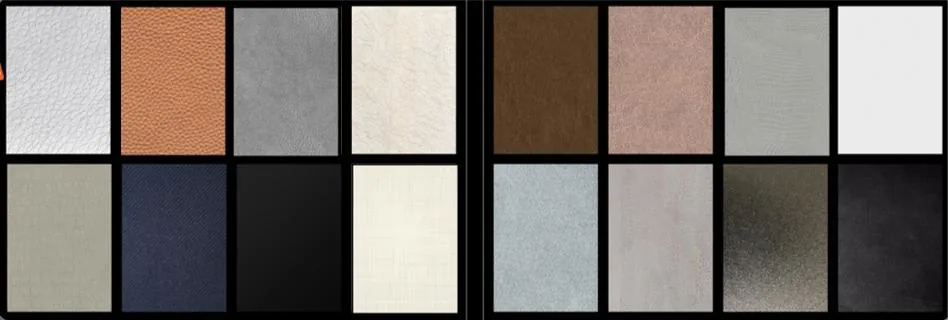
Puremorfilm offers this paint-free face for flat furniture panels: a silicone functional surface on PET support, distinct from PVC film, melamine-faced board, PP film and PETG-faced products. Furniture makers bond it with PUR by flat lamination; we supply it mainly in rolls, with faced panels available on request. Standard supply has no back adhesive, and the woodgrain, texture and gloss can be customized.
The silicone surface is inherently flame-retardant. In the manufacturer’s laboratory tests, coffee, red wine and soy sauce left at 25°C for 24 hours wiped off with no obvious change. The formulation is No DOP, and the formaldehyde-free statement applies to the film, not the assembled sideboard.
Discuss furniture decorative film for flat faces. It is outside the scope of curved shells, wrapped legs, moldings, floors, countertops, stovetops, shower floors and other walking surfaces. Free samples can help you compare the reproduced pattern with your existing wood.
How do you start a mid-century modern room?
Choose the furniture that will lead the room, then set the wood tone, supporting colors and light around its actual use. Leave the small objects until the main layout works.
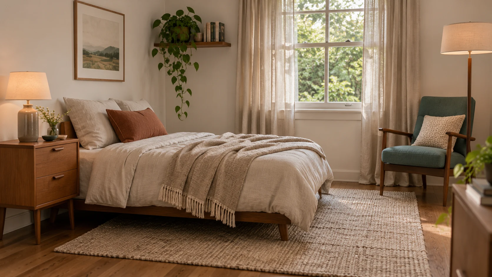
- For a living room, start with a comfortable sofa or chair and a clear route through the seating group.
- For a dining room, choose the table-and-chair relationship before the decorative light and accessories.
- For a bedroom, use a quieter color base and add the main character through a bedside piece, headboard or chair.
- For new built-in storage, decide the cabinet proportions and grain layout before choosing a face material.
Keep direct sun away from valued veneer pieces, and compare new surfaces beside the furniture you will retain. For a flat vertical reproduced woodgrain, contact us to discuss samples and the silicone-faced option.
Frequently Asked Questions
What makes furniture mid-century modern?
Clean lines, slender legs, low profiles, organic curves and restrained ornament are common features. The way wood, upholstery and manufactured materials work together is also part of the style.
How do you mix mid-century modern with other styles?
A mid-century lead piece can work with contemporary, Scandinavian or more layered furniture when the colors and proportions connect. Keep the main layout coherent before adding further stylistic references.
What is the difference between mid-century and mid-century modern?
Mid-century names a period, while mid-century modern identifies a modern design vocabulary associated with that period. Everyday usage overlaps, and today’s design accounts often include later pieces within the broader style.
How do you design a mid-century modern bedroom?
A clean-lined bed, soft neutral base and one distinctive bedside cabinet or chair provide a useful starting point. Add texture through bedding and a rug while keeping the furniture proportions clear.
Can a mid-century modern room look dark and moody?
Yes, deeper walls or upholstery can work with warm wood and a few brighter accents. Keep enough contrast and local lighting for the furniture forms and daily activities to remain clear.