
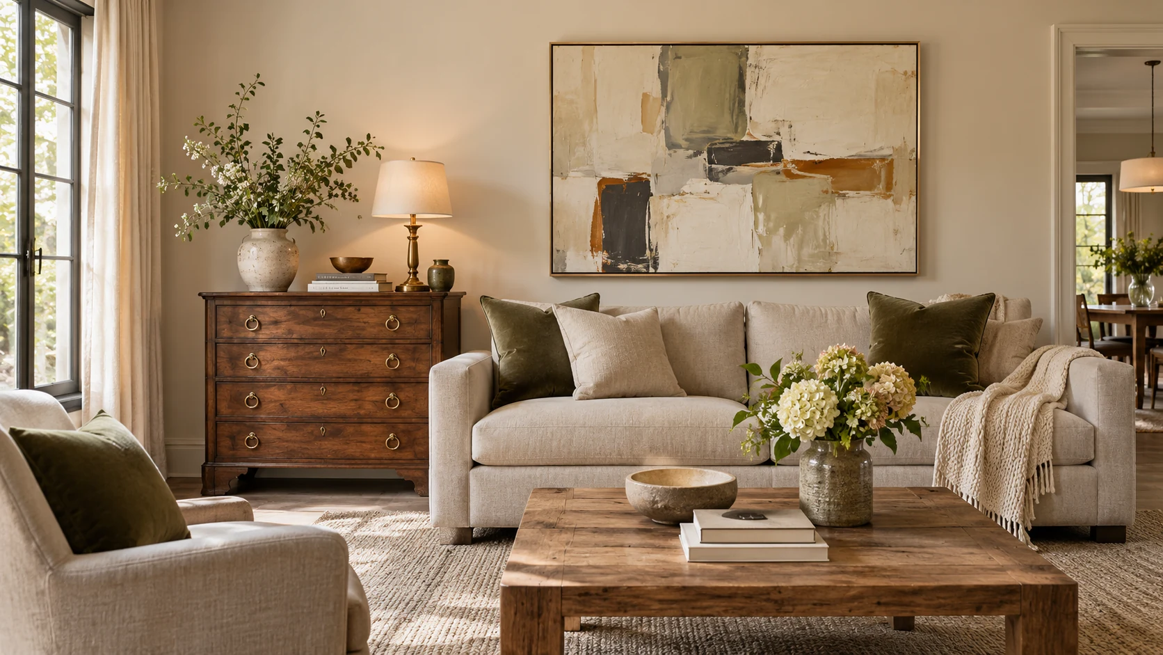
Transitional interior design combines traditional furniture shapes and warmth with the cleaner lines of contemporary rooms, usually on a calm neutral base. To mix old and new, connect the pieces through proportion, color, material or finish, then vary their shapes and textures. The room can accommodate inherited furniture and current pieces without buying a matching set.
What is transitional interior design?
Transitional interior design is a way of bringing traditional and contemporary elements into one coherent room. It keeps familiar, comfortable furniture forms while reducing the amount of ornament and visual clutter.
A curved upholstered chair can sit beside a straight-lined sofa. An older wood cabinet can support a contemporary artwork. The connection might be their scale, a repeated dark color or a metal finish that appears elsewhere in the room.
The usual base is quieter than either of those individual pieces. Soft wall colors, a large rug and restrained window treatments let the furniture mix remain visible. Texture supplies variety without requiring a different pattern on every surface.
You will encounter different interpretations. A classic approach emphasizes neutrals, symmetry and subtle curves. More recent designer interpretations mix periods with greater contrast, including stronger colors and contemporary art. Both can be transitional if the objects have a visible relationship and the room remains comfortable to use.
You can build the room around meaningful furniture you already own. Start by identifying what you want to keep and why. The design can grow around a well-used table or inherited chest instead of treating every older object as a problem to remove.
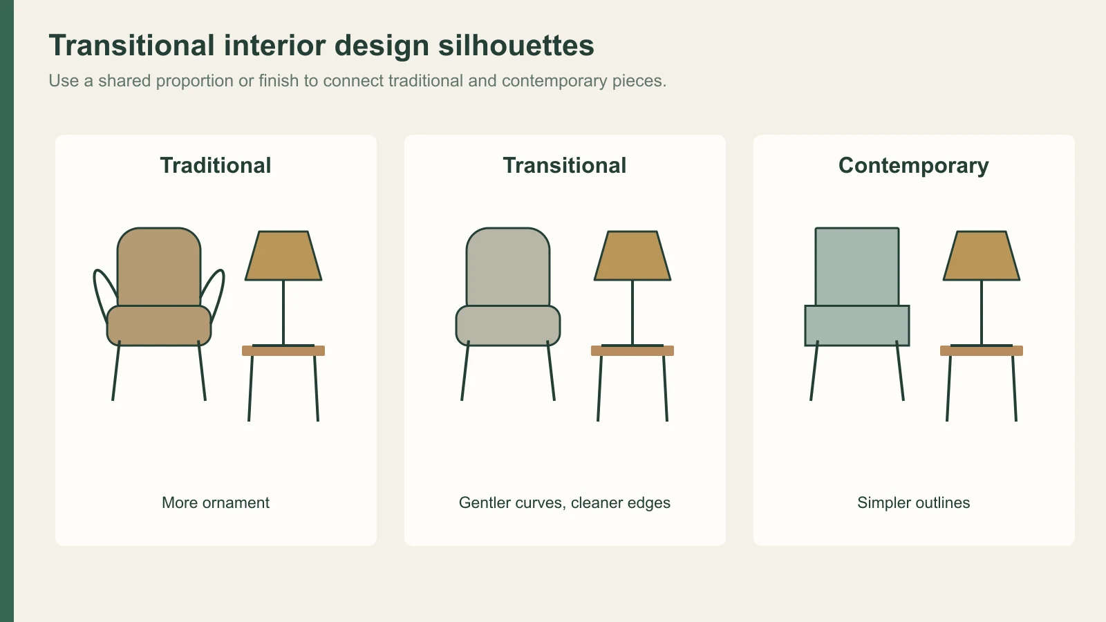
How is transitional different from traditional and contemporary?
Transitional interiors generally use less ornament than traditional rooms and more familiar warmth than a sharply minimal contemporary room. These are tendencies, not strict boundaries: contemporary design itself includes many warmer approaches.
| Element | Traditional tendency | Transitional approach | Contemporary tendency |
|---|---|---|---|
| Furniture shape | More formal profiles and decorative detail | Familiar shapes with cleaner edges | Simpler or more sculptural forms |
| Composition | Coordinated groups and established arrangements | A deliberate mix joined by scale or finish | Greater freedom in shape and arrangement |
| Color | Can include rich, layered patterns | Often a neutral base with selected accents | Can range from quiet tones to strong contrast |
| Materials | Wood, textiles and decorative finishes | Wood and soft fabric beside glass, metal or stone | A broader mix of current materials and finishes |
| Accessories | More detailed display | Fewer objects with clear roles | Often a more selective or graphic display |
Use the comparison to decide what your room needs. A traditional room with heavy curtains, carved furniture and several patterns might need simpler upholstery and a clearer layout. A sparse new room might need wood, a rug and more comfortable furniture shapes.
You do not have to divide the purchases evenly between “old” and “new.” One strong traditional piece can give a mostly contemporary room its history. A contemporary lamp and artwork can change how an older furniture group reads without replacing the group.
What are the key features of transitional style?
A calm base, comfortable furniture, layered texture, selective decoration and balanced proportions are the main features. The room should feel composed without looking as though every object came from one collection.
Furniture often has clear outlines with a small amount of curve: a gently rounded arm, a shaped chair back or a table with a softer edge. These forms can connect more elaborate older furniture to simpler new pieces. They give the eye an intermediate shape between the two.
Balance can come from scale rather than identical pairs. A substantial cabinet on one side of a room might be balanced by a seating group and artwork on the other. A very small modern table beside a heavy traditional sofa may feel accidental even if the finishes match.
Leave useful clear space around the furniture. A room that can accommodate conversation, reading and movement already has a stronger foundation than one arranged only for a photograph. The coffee table should be reachable from the seating, and the route to the door should be easy to see.
Accessories work best when they have a reason to be there. A collection, family photograph or artwork adds more character than several unrelated decorative purchases. Give important objects enough room to be seen and store the rest until you have a place for them.
Which colors work in a transitional room?
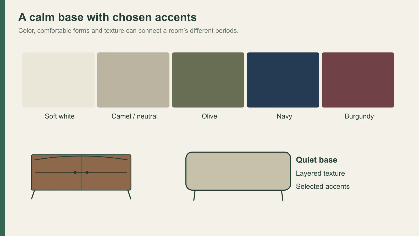
Soft white, beige, gray and camel are common base colors, with navy, olive or charcoal as accents. A more expressive version can also use tobacco, burgundy, aubergine, deep blue or dusty rose.
Choose the approach that fits the furniture you are keeping. An inherited dark wood cabinet may look more integrated beside a warm neutral wall than beside a very cool gray. A pale modern sofa can provide relief when the older pieces are visually heavy.
Classic transitional guidance often keeps patterns restrained. Current interpretations may introduce a floral, stripe or check to create contrast. Give the pattern a defined role, such as a chair or cushion group, so it connects to the room’s colors without taking over the background.
Neutrals still need comparison in the room. Adjacent colors affect each other’s appearance, as described by the CIE’s definition of chromatic induction, and the same samples can read differently under different lamps. Use the interior design color palette guide to compare the neutrals as a group.
Put the larger samples where the finishes will actually sit. A vertical cabinet sample beside the old wood piece gives a more useful comparison than several small cards laid flat on a bright desk. Look again in evening light before deciding the final combination.
How do you mix antique and modern furniture without clashing?
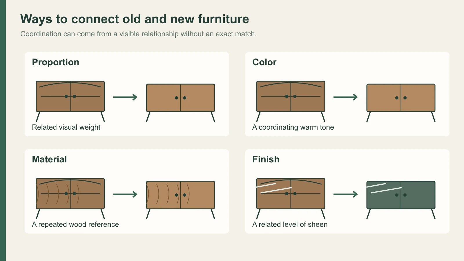
Connect the pieces through at least one visible relationship: proportion, color, material or finish. Then let the differences in age and shape give the room its character.
| Existing piece | New partner | A useful connection |
|---|---|---|
| Dark traditional chest | Clean-lined upholstered chair | Similar visual weight with a lighter fabric |
| Curved antique dining table | Simpler dining chairs | A shared wood warmth or repeated upholstery color |
| Ornate mirror | Plain console | Enough width and weight to support the mirror visually |
| Older timber furniture | New flat-faced storage | Coordinating tone and sheen, without promising an exact match |
Avoid choosing a new piece only because it resembles the old one. A nearly matching wood color can make the difference more noticeable than a deliberate contrast. A simpler, clearly related tone may give both pieces more room to look like themselves.
ANSI/AWI 0642–2024, section 3.4.1, describes adjacent veneer and solid wood in transparent-finished paneling as well matched at Premium grade and compatible at Custom grade. This is a wood-paneling standard, not a rule for arranging antiques. Its language gives a useful model for the conversation: coordination is a clearer goal than a promise that different pieces will be identical.
Age adds another variable. The Timber Veneer Association of Australia’s care guidance explains that wood veneer changes color under natural and artificial light, while conventional coatings can yellow over time. A new wood sample and a decades-old finished surface have had different histories.
When adding cabinetry, decide whether you want real wood or a reproduced decorative face. The wood veneer versus laminate guide explains that construction choice. For a kitchen, a deliberate difference between old and new can also support two-tone kitchen cabinets, provided the colors relate to the room as a whole.
How should transitional design respond to your home’s architecture?
Preserve the features that give an older house its character, and add warmth to a simpler new house through furniture, materials and light. The same decorative treatment does not suit both starting points.
In an older room, original cornices, doors or paneling can provide the traditional layer. Simpler furniture, contemporary art and restrained lighting can then give the space a current use. Assess original details before removing or covering them; their proportions may be doing more for the room than a photograph first reveals.
In a new room with plain walls, wood furniture, stone, a rug and softer lighting can create depth. Complex imitation period details are only one possible route, and they may compete with the room’s existing openings and proportions. Try the furniture and material composition before adding more architecture.
If wall treatment is needed, compare wall paneling ideas against the actual ceiling height, doors and furniture. The panel divisions should make sense around those fixed elements. A generic pattern pasted onto every wall can make an otherwise simple room feel busy.
Follow the architecture when placing larger pieces too. A fireplace, bay window or strong central opening may organize the seating naturally. Where there is no such feature, a rug and furniture group can define the center without constructing an artificial focal wall.
Which materials and textures make the room feel layered?
Wood, stone, leather, glass and metal create a useful base, while linen, velvet, chenille and other textiles add softer differences. Layering works through contrast in feel and appearance rather than sheer quantity.
| Combination | What it adds | How to keep it readable |
|---|---|---|
| Wood and stone | Warm grain beside a more continuous mineral surface | Let one pattern lead if both are strongly figured |
| Linen-like weave and velvet | Dry-looking texture beside a smoother pile | Keep their colors related when the furniture shapes differ |
| Leather and chenille | A firmer surface beside softer upholstery | Distribute the contrast across the seating group |
| Glass and wood | A lighter-looking element beside a heavier one | Keep the glass piece useful and proportionate |
| Metal and fabric | A repeated small highlight beside soft surfaces | Repeat the metal selectively in lighting or hardware |
Use texture where it can be experienced. A fabric on the main chair affects the room differently from a textile hidden behind it. The guide to tactile interior design explains this connection between the visual impression and the surfaces you actually touch.
Large patterned materials need room. A strongly veined stone, figured wood and patterned rug can compete when all are equally prominent. Keep one as the lead and use calmer partners if the room is already full of distinctive furniture.
Review the actual combinations on an interior design material board. Include the older finish you are keeping, not just the new purchases. A photograph can help identify the piece, but a comparison in the room is better for deciding the relationship between colors and sheen.
Leave some surfaces clear. A console with one meaningful artwork and a useful lamp may contribute more than a dense display. You can rotate smaller collected objects without changing the furniture plan.
Where does silicone-faced film fit in a transitional room?
Silicone-faced decorative film can provide a new decorative face for flat cabinet doors and vertical wall panels. A reproduced woodgrain or neutral color can coordinate with older furniture through tone and sheen.
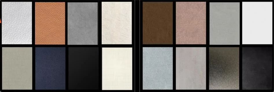
Puremorfilm makes the film with a silicone functional face over PET support, a paint-free option that differs from PVC film, melamine-faced board, PP film and PETG-faced products. Panel and furniture makers apply it by PUR flat lamination; it is supplied mainly in rolls, and faced panels can be quoted on request. Standard supply has no back adhesive, and texture and gloss can be customized to sit beside an older finish.
The silicone surface is inherently flame-retardant. In the manufacturer’s laboratory tests, coffee, red wine and soy sauce left at 25°C for 24 hours wiped off with no obvious change. We use a No DOP formulation, and the film itself is formaldehyde-free; neither statement covers the complete panel or furniture.
For furniture decorative film, keep the proposal to flat faces. Raised moldings, carved profiles, curved wrapping, floors, countertops, stovetops, shower floors and other walking surfaces are outside this route. Review free samples beside the piece you are keeping; an exact color match to an aged finish should not be assumed.
How do you start a transitional design plan?
Start with the architecture and furniture that will stay, then invest attention in the longer-lasting decisions: storage, major materials and lighting. Add collected objects gradually after the room works for daily life.
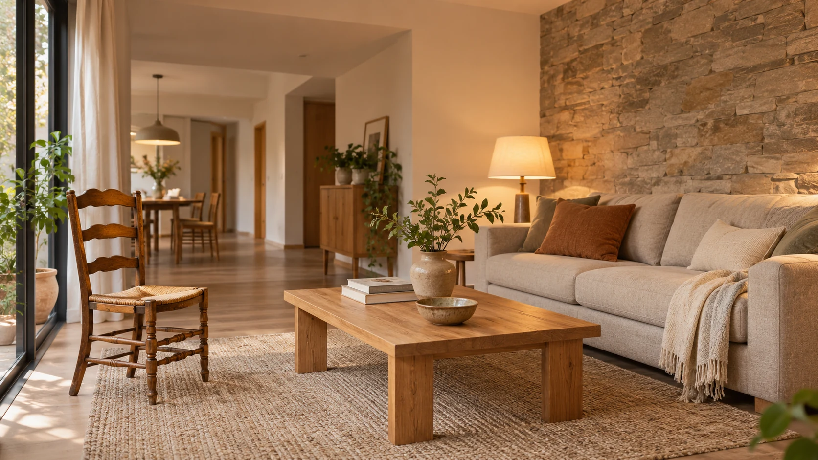
- If the room is traditionally furnished, simplify the large background surfaces and introduce a cleaner-lined partner for the main piece.
- If the room is new and sparse, add comfortable upholstery, wood and texture before adding complicated architectural details.
- If you are keeping an inherited cabinet or table, use its scale and tone to choose the neighboring furniture.
- If new cabinetry will sit beside old furniture, plan a coordinating face and sheen using samples in the room.
Leave some space for future art, furniture and objects. For a flat vertical decorative surface within that plan, contact us to discuss samples and a silicone-faced option that can be reviewed beside your existing materials.
Frequently Asked Questions
What makes transitional design different from traditional or contemporary?
Transitional design combines traditional furniture warmth and shapes with contemporary restraint. It usually has less ornament than a traditional room while retaining comfortable, familiar forms.
Can I incorporate bold colors in a transitional space?
Yes, a bold chair, artwork or textile can sit within a quieter base. Repeat a related color elsewhere if the accent needs a clearer connection to the room.
What type of furniture works best in transitional interiors?
Clean-lined furniture with gentle curves works well beside more traditional pieces. Comfortable proportions and a visible relationship in color, material or finish help the mix feel coherent.
Can transitional design work in smaller spaces?
Yes, a selective furniture plan, clear routes and restrained accessories can suit a smaller room. Choose pieces for their actual dimensions rather than filling the space with a complete matching suite.
How do I personalize a transitional space?
Meaningful art, inherited objects and collected pieces give the room its individual character. Display a selection with enough clear space around it, then change smaller objects as the room develops.