
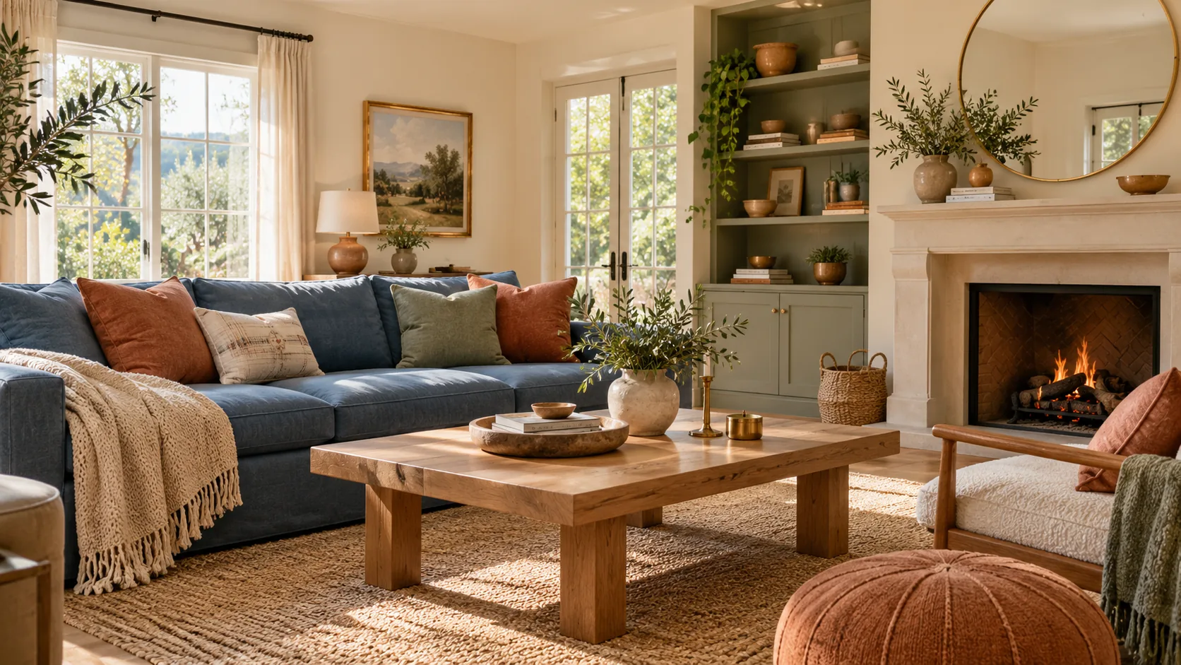
An interior design color palette is a small set of colours with assigned jobs: a background, colours for larger furniture and finishes, and one or two accents. Build it from what the room keeps, such as its floor, wood or stone. Then compare the shortlist beside those materials and under the room’s own light.
Start with the combinations below, then decide where each colour belongs. The same group of colours can produce different rooms when you change the wall colour, the largest upholstered piece or the amount of a strong accent.
What makes a good interior design color palette?
A good palette gives its colours different roles and provides the contrast you want between them. Think about light and dark, warm and cool, and muted and stronger colours as well as the names on the swatches.
The House Beautiful combination guide illustrates that range with schemes from sage and taupe to burgundy and lilac. A pale background with a dark accent works differently from a room where the darker colour covers the walls.
Variations within a colour also give you room to adjust. In the conventional colour-wheel vocabulary described by Adobe Express, adding white produces a tint, adding black produces a shade and adding grey produces a tone. These terms help distinguish a pale pink, a deeper red and a more muted version of a colour.
Choose a direction you want to look at every day. The examples are starting points for your room, with the existing finishes and objects still in place. You can then decide which colours should occupy large areas and which deserve a smaller role.
Which calm palettes are easiest to live with?
Layered neutrals, earthy colours and blue-green schemes offer several restrained starting points. Your own preference decides which of them feels comfortable to live with.
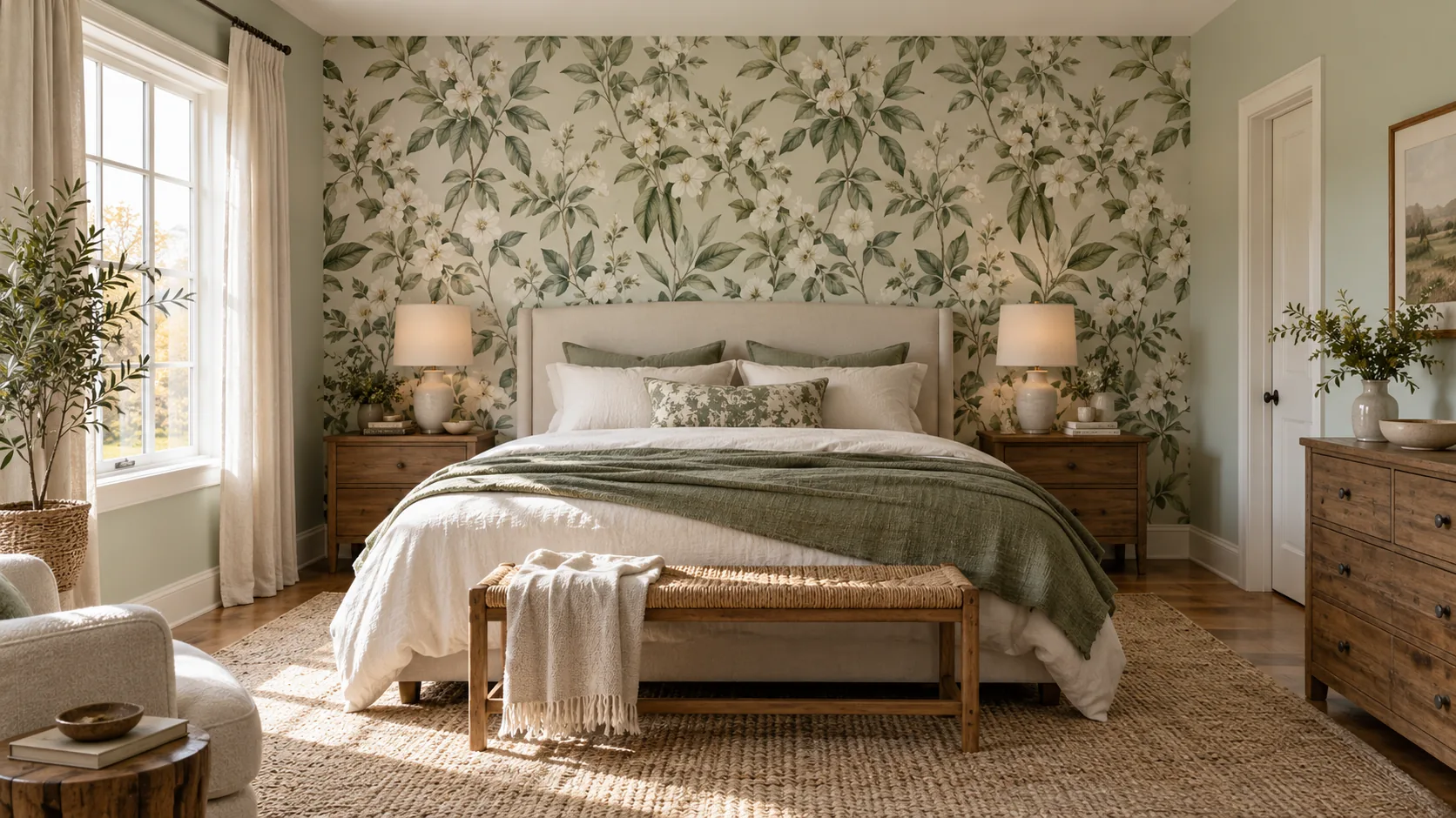
The designers in Emily Henderson’s comfort-palette article describe their personal preferences. Their combinations range from textured neutrals to olive and rust, and from warm browns to blue, white and wood.
The roles below are suggested ways to use the source combinations, rather than room specifications supplied by those designers.
| Palette direction | Suggested wall or background | Suggested larger pieces | Suggested accents | Starting-point source |
|---|---|---|---|---|
| Layered neutrals | A pale neutral | Different neutral textures | A deeper neutral or olive | EHD: Brady Tolbert |
| Olive, beige and rust | Beige or off-white | Olive, warm wood or black | Rust | EHD: Emily Bowser |
| Brown, taupe, white and grey | White or a pale warm neutral | Brown and taupe | Black or grey | EHD: Ajai Guyot |
| Blue, white and wood | White or a soft blue | Blue with wood | Brass, green or blush | EHD: Emily Henderson |
| Wood with red, white and blue | White | Wood and denim-like blues | A small red element | EHD: Max Humphrey |
| Sage and taupe | Sage or taupe | The other muted colour | A deeper berry colour | House Beautiful |
| Green and cream | Cream | Green and wood | A darker detail | House Beautiful |
| Emerald and soft blue | Soft blue | Green | A restrained neutral | House Beautiful |
Begin by deciding which existing object would stay in each direction. A blue sofa, warm timber floor or large cream rug already occupies a substantial part of the scheme. Keep it in the comparison instead of selecting an entirely new set of colours in isolation.
Texture can give closely related colours a clearer role. A woven neutral, a smooth painted surface and a visible wood grain contribute different appearances even when their colours are quiet. The guide to tactile interior design explores those material choices.
Which bold color combinations actually work?
Muted versions of strong colours, a light-and-dark pairing, or a concentrated accent can make a bold combination easier to place in a room. Decide which colour leads before distributing both across every surface.
The Interior Collective’s palette examples show several ways designers combine colours that might initially seem difficult. The applications below are visual proposals based on those pairings.
| Source combination | Suggested larger colour role | Suggested smaller role | Detail to compare |
|---|---|---|---|
| Muted green and brick red | Green walls or a large green piece | Brick-red textile or furniture detail | Wood alongside both colours |
| Blue, mauve and plum | Blue background or upholstery | Mauve and a deeper plum | Differences in depth between the colours |
| Fuchsia and lime | A restrained background around the pair | Concentrated fuchsia and lime elements | How much of each appears in the room |
| Light blue and deep red | Light blue on the larger area | Deep red on selected pieces | The contrast between light and dark |
| Mauve and gold | Mauve as the principal coloured area | Gold-toned details | The materials carrying the gold appearance |
Other possibilities include burgundy with lilac, pink with terracotta, and red with orange on a soft neutral background. Black can also frame a more varied collection of colours. Compare these options with the objects you already own.
For a first trial, put the stronger colour on something with a distinct boundary: a chair, curtain, artwork or cabinet front. You can see its relationship to the room before deciding whether the same colour should cover a much larger area.
Keep the less conspicuous colours in the review too. The wood, floor and neutral background often determine how much contrast a strong accent creates.
How should you use the color wheel without letting it decide?
Use the wheel to find related or opposing hues, then choose the versions and proportions that suit the room. The diagram provides a relationship between colours; it leaves the materials and their placement for you to decide.
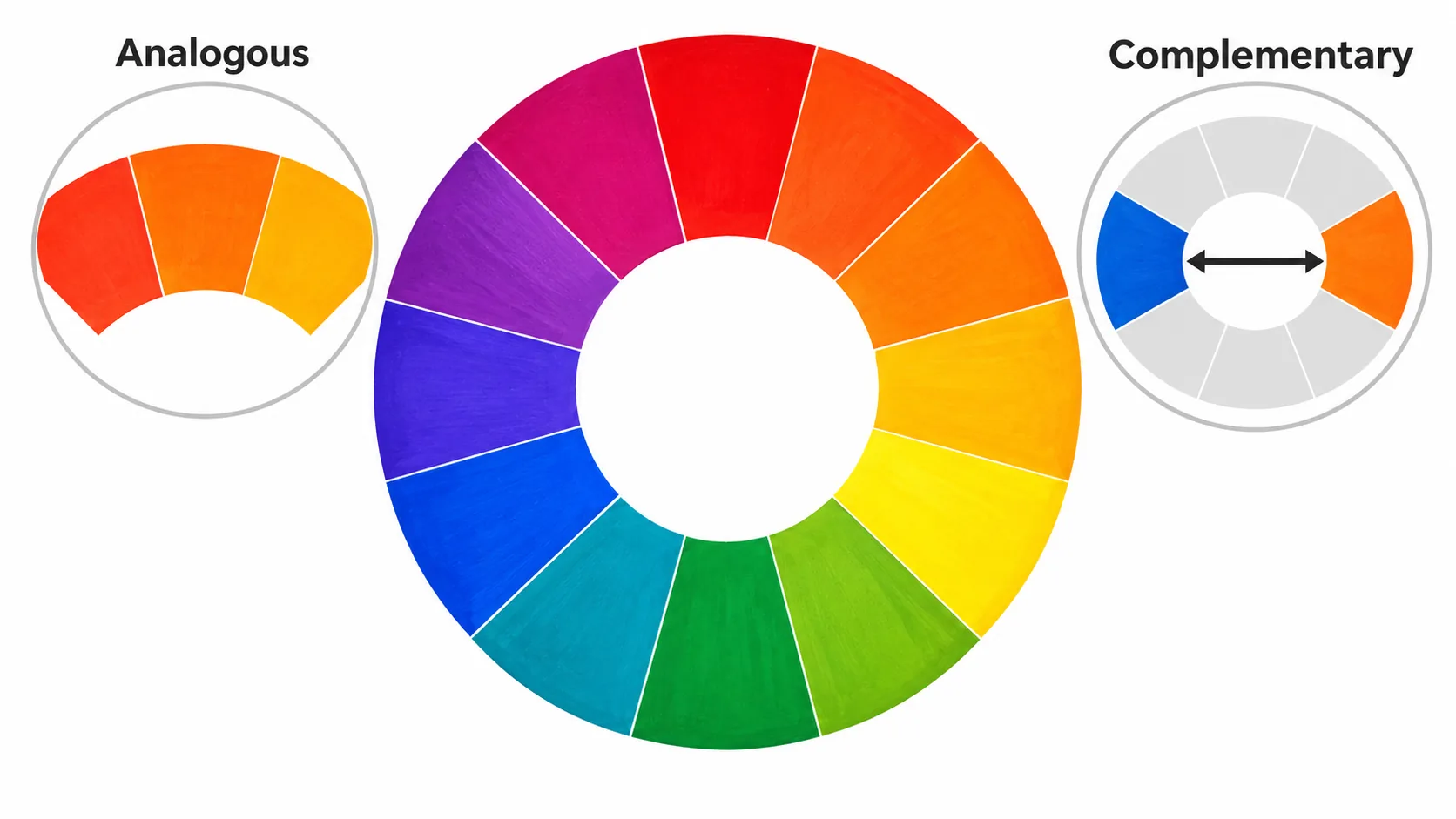
Analogous colours sit next to one another on the wheel. Complementary colours sit opposite one another. A traditional painter’s RYB wheel uses red, yellow and blue as its primary colours, as the Adobe guide explains.
A blue-and-green direction draws on neighbouring hues. A stronger opposing-colour direction gives you another way to explore contrast. Pale, dark and muted versions expand either direction beyond the brightest colours in a basic wheel.
A monochromatic scheme is another option. Several versions of yellow, for example, can form a room scheme when their lightness differs. Give at least one element a distinct contrast so the individual pieces remain visible within the same colour family.
A visually pleasing combination does not have to be an exact complementary pair. Pale blue with a rose accent can be a design proposal without being labelled a technical opposite on the wheel. Keep that distinction when using a palette generator or a diagram as a starting point.
How do you divide a palette across walls, furniture and accents?
Assign a background, a larger furnishing colour and a smaller accent before shopping for individual objects. Then compare how much of each is actually visible in the room.
| Role | Places it might appear | What to compare |
|---|---|---|
| Background | Walls, existing floor, large rug or built-in surfaces | Whether it suits the finishes you will retain |
| Larger furnishing colour | Sofa, curtains, bed or substantial cabinet front | Whether it supports or contrasts with the background |
| Accent | Artwork, cushions, a small chair or a visible detail | Whether it remains a deliberate part of the room |
The roles can change within the same combination. A light-blue room with rose details differs from a rose room with a light-blue sofa. Cream and pale yellow can occupy the larger areas while brown supplies a deeper accent.
Black can act as a frame around colourful objects or a focal point. Wood can sit between muted green and brick red, adding another visible material to the pairing. Include those existing materials when deciding how many new colours to introduce.
Use the proposed roles as a check on purchases. If every new object becomes another strong accent, the room gradually moves away from the scheme you selected. A photo of the current room and a short list of colour roles can make that drift easier to spot.
How do existing wood, stone and floors change the choice?
Your retained wood, stone and floor already belong to the palette, and adjacent colours can affect how each appears. Compare the proposed colours directly beside those materials.
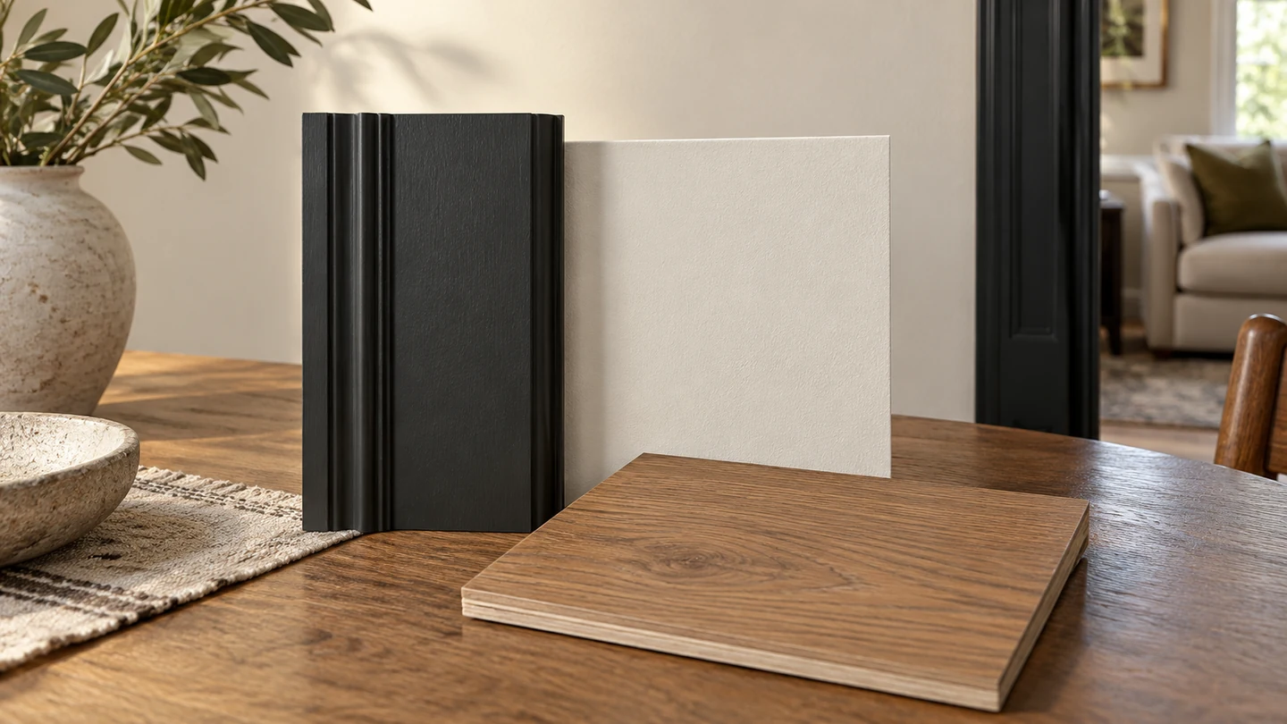
The CIE vocabulary entry for chromatic induction describes this mutual effect when colour stimuli are viewed side by side. It treats the effect as almost immediate, distinct from the slower process of chromatic adaptation.
For your room, place a paint sample, fabric or panel sample at the actual material junction. Keep the lighting consistent while comparing different neighbours. This helps you judge the adjacent colours together rather than relying on a swatch viewed elsewhere.
A warm grey beside terracotta is a different choice from a much cooler grey. Likewise, pistachio green next to light wood creates a different degree of contrast from green next to a much darker wood. Those examples in the colour-combination guide are reasons to keep the real wood in the comparison.
The two-tone kitchen cabinet guide gives a more specific application of side-by-side colour judgment. For a whole room, extend that same comparison to the floor, large furniture and any stone you plan to keep.
Why does the same palette look different under your lights?
The room’s light changes how the selected materials appear, so inspect the shortlist under the lighting you will use. Daylight and an evening lighting arrangement can reveal different relationships between the same pieces.
X-Rite’s explanation of visual evaluation notes that lamps with the same correlated colour temperature can have different spectral distributions. A Kelvin value describes only part of the source. Its example compares daylight measured at 5000K with an artificial source carrying that same rating.
Daylight also varies with time, weather and season. For a practical room check, look at the proposed paint, textiles and panel faces during the day and again with the evening lights switched on. Keep the actual finishes together during those comparisons.
When selecting or replacing a lamp, retain its specific model information as well as the colour-temperature label. That gives you a more useful record of the lighting you evaluated.
The metamerism guide explains changes in matching under different light sources in more detail.
If a textured wall is involved, the direction of light also deserves attention. Wall washing and wall grazing show different ways of revealing a wall surface.
How do you turn inspiration into a palette for your home?
Choose a source of inspiration, extract a short colour list, assign roles and compare physical samples in the room. That sequence turns a saved photograph or generated palette into a decision you can inspect.
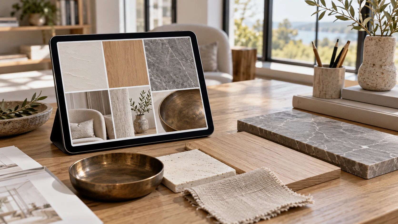
Inspiration can come from a shop, café, museum, artwork or a room you already like. Identify the particular relationship you want to borrow: a pale background with dark furniture, related greens, or a small strong accent within a neutral room.
A palette generator can help produce alternatives. Use it to compare colour directions and narrow the shortlist. The physical materials and room lighting still need to be assessed together before a paint, textile or panel face is selected.
For rooms visible from one another, try repeating a background colour, a neutral or a wood appearance across the view. This is a design suggestion for continuity; each room can still have a different accent or a different balance of the shared colours.
Write down what stays, what changes and the role of each proposed colour. An interior material board can then hold the selected physical samples in context.
Where do cabinet and wall panel faces fit in a palette?
New cabinet and wall-panel faces become another visible colour and texture in the room. Compare them with the selected paint, floor and furnishings before approving the facing.
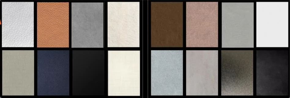
Puremorfilm makes paint-free decorative film with a silicone functional face, distinct from PVC, melamine, PP and PETG decorative faces. More than 100 patterns are available, with texture and gloss customizable on request. We use a No DOP formulation. The silicone surface is inherently flame-retardant; higher grades up to UL 94 V-0 are available on request. In the manufacturer’s laboratory tests, coffee and red wine left at 25°C for 24 hours showed no obvious change after wiping. Our main supply is rolls that panel and furniture makers apply by PUR flat lamination; faced panels are available on request.
Film test results apply to the film, not complete cabinetry or a wall assembly. The film’s leather-like feel and some elasticity make it unsuitable for floors, stove worktops, shower floors and other walked-on areas.
For measured light-reflectance information about a proposed facing, the decorative film LRV guide explains the evidence to look for. Keep that information alongside the physical sample and the room’s own light.
- Keeping a floor or large piece: choose the new colours beside that retained material.
- Replacing lighting: review the shortlisted materials under the actual new lamp.
- Ordering cabinet or wall-panel faces: compare physical samples with the selected paint and furnishings.
Once the palette roles are clear, you can contact us with the proposed cabinet or wall-panel locations, retained finishes, and colours and textures you want to compare in physical samples.
Frequently Asked Questions
How do you choose a room color palette?
A room palette starts with its retained finishes and a small set of background, furnishing and accent colours. Physical samples beside the existing materials, viewed under the room’s lighting, help you choose between the shortlisted combinations.
Can I use an interior design color palette generator?
Yes, a generator can help you compare directions and produce a shortlist. Final paint, textile and panel choices still need to be assessed as physical materials in the intended room.
What is the best color for bedroom walls?
A soft blue, a muted sage or a pale warm neutral offers a starting point to compare with your own furnishings and preferences. There is no single best bedroom colour; a sage-and-dusky-pink scheme is one of the source guide’s bedroom proposals.
How does a color wheel help with an interior palette?
A colour wheel shows neighbouring and opposing hue relationships. It helps generate combinations while the room’s existing materials, lighting and chosen colour roles guide the final selection.
Which interior color schemes suit a modern house?
Layered neutrals, black and white with one stronger accent, or light wood with a selected colour can all be starting points. Choose the version that works with the retained finishes and the way you want the rooms to look together.