
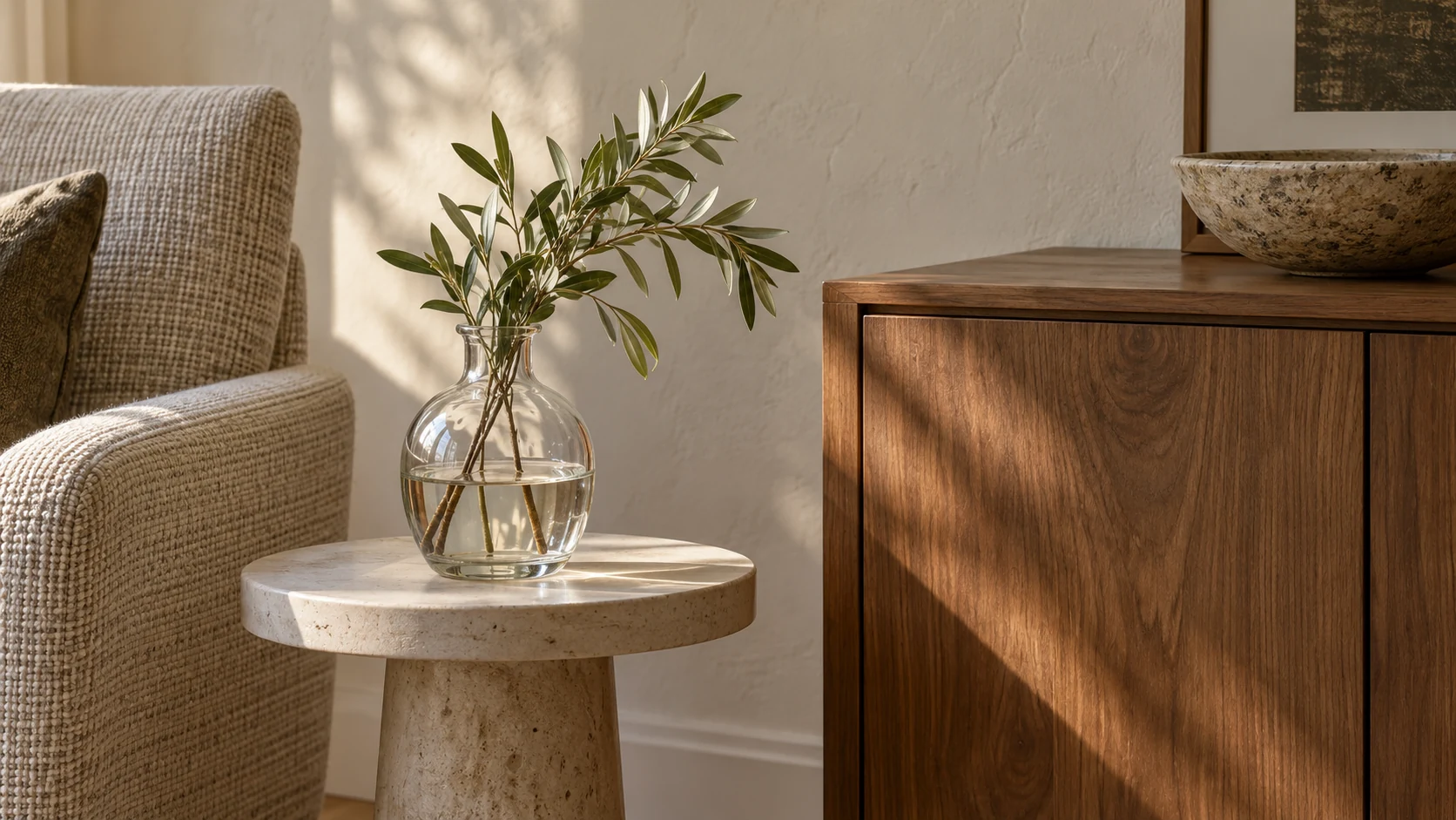
Tactile interior design combines surfaces with different feels, such as woven textiles, smooth glass, grained wood and textured panels. Start with the places your hands meet, then balance them with the room’s larger surfaces. A cabinet front that needs frequent wiping and a bedroom cushion can carry very different textures.
You can work with an existing room. The sofa, floor, cabinets and curtains already contribute texture, even when their colors are quiet. Before adding a finish, identify what you want to change: a room that looks flat, a surface that feels uncomfortable or an area that takes too much effort to maintain.
What is the tactile finishes trend in interior design?
The tactile finishes trend treats how a surface feels as a design choice alongside color and pattern. Designers combine woven textiles, wood grain, stone, fluted details and soft or smooth faces. A useful scheme matches each texture to how closely people touch it, how light reveals it and how it will be cleaned.
| Design direction | Actual contact feel | A possible position | What to establish |
|---|---|---|---|
| Woven textile | Fiber, weave and cushioning | Cushions, seating or a covered wall | Whether the actual fabric suits the expected contact and cleaning |
| Wood | Grain and the applied finish | Furniture, doors or wall details | How the finished sample feels, including edges |
| Glass or metal | A hard face, sometimes with relief | Objects, fittings or furniture details | Smoothness, reflected light and comfort where hands rest |
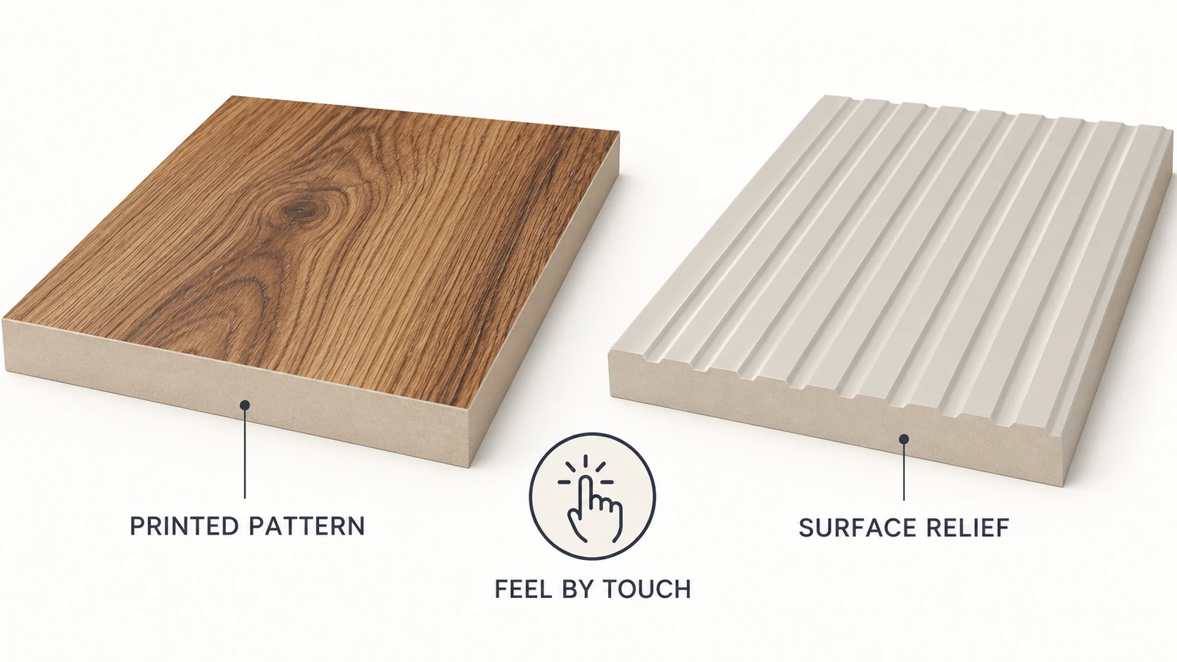
| Textured facing | Smooth printing, embossing or another surface treatment | Cabinet fronts or decorative panels | The exposed material beneath the appearance |
Tactile interior design can be restrained. A plain cabinet front beside a woven chair can create a clearer contrast than several competing relief patterns. The choice concerns the relationship between surfaces as much as the character of each one.
What is the difference between visual texture and actual feel?
Visual texture is what a surface suggests to your eyes; actual feel includes relief, friction, softness and the temperature sensation when you touch it.
A printed woodgrain can suggest open grain while feeling smooth. An embossed face can add ridges you feel with a fingertip. The Getty’s explanation of texture distinguishes physical surface texture from texture conveyed visually. Both have a place in a room, but they answer different preferences.
Warm-looking colors also tell you something different from warm contact. Metal and wood kept in the same room can feel different when touched because they exchange heat with your hand differently. In a BioResources experiment on visual and tactile warmth, color strongly influenced visual warmth, while thermal properties influenced warmth felt through touch. Those wood-sample findings give you a reason to record visual and tactile judgments separately.
For a chair arm or cabinet pull area, test the contact you will experience. A surface you like from across the room may feel too rough under a resting hand. Likewise, matte describes an optical quality, while soft touch describes a tactile one. Our soft-touch finish guide explains that distinction and why fingerprint performance needs its own evidence.
Which materials add texture to a room?
Textiles, wood, stone, glass, metal and textured finishes give you different combinations of softness, grain, relief and sheen.
The material name starts the comparison. The working face finishes it: polished and textured stone offer different experiences, just as a coated wood face differs from an unfinished one. In tactile interior design, compare the supplied finish you will use, including any coating.
| Material family | Visible character | Feel to compare | Maintenance question |
|---|---|---|---|
| Textiles | Weave, pile or knitted structure | Fiber feel, softness and cushioning | Is care based on vacuuming, spot cleaning or another specified method? |
| Wood | Grain, color variation and finish | Surface grain, smoothness and contact warmth | What care does the applied finish allow? |
| Stone or ceramic | Veining, color, glaze or relief | Hardness, surface relief and edges | Which instructions cover this stone, glaze or treatment? |
| Glass or metal | Reflection, transparency or a muted finish | Hard contact, smoothness and raised details | How are smears removed without altering the finish? |
| Decorative facing | Printed pattern, solid color or embossing | The exposed face and depth of texture | What is the actual surface, and how is it maintained? |
Use the room’s function to narrow this range. Seating puts fabric against skin and clothing. A wall may be seen mainly from a distance. A cabinet front combines repeated touch with visible reflections. You can compare the larger constructions in our wall panel material guide, then use the wall-covering overview to distinguish panels from paper, textiles and other coverings.
How do you layer textures without clutter?
Choose a dominant large-surface finish, then add contrasting feels in smaller, separate places.
Begin with what occupies the most visual space: the walls, flooring, main upholstery or a bank of cabinets. Keep that element in view while trying the next material. A quiet wall can accommodate a more pronounced woven chair; a strongly patterned wall may work better with simple furniture faces.
Contrast can come from the finish alone. Smooth glass beside woven fabric gives you a different relationship from glass beside polished metal. In a restrained color palette, changes in grain, weave and sheen can provide variation without another strong pattern.
Light changes what you notice. Raking light can make relief obvious, while a different light direction can leave the same face looking quieter. The comparison between wall washing and wall grazing shows why a finish should be viewed with its proposed lighting. For cabinet faces, the matte-versus-gloss comparison covers reflected light in more detail.
Try a removable element before committing to a large fixed surface. Move a cushion, bowl or small material sample beside the existing finishes and view them together. Leave enough space around it to see its outline and texture. Tactile interior design works through these relationships, so judging every piece alone can produce an unexpectedly busy room.
Where does maintenance change the finish choice?
Frequent-touch and spill-prone areas need a surface whose documented care routine fits the way the room is used.
A genuine woven panel and a smooth facing printed with a linen pattern may look related while requiring quite different care. The actual exposed material determines what you can do when it gets dirty.
Herman Miller’s Textiles Care and Maintenance guide, dated February 2022, gives a useful example. Its workspace and acoustic fabric instructions call for vacuuming and prohibit liquid application and steam. In the same document, the Ace, Marvel, Sequel and Summit high-performance upholstery materials allow mild, nonabrasive soap with lukewarm water. These instructions apply to those specified materials.
| Check before choosing | What to compare on the actual finish | How it changes the decision |
|---|---|---|
| Exposed surface | Real textile, coating, wood finish or another face | A texture name alone leaves the care method unresolved |
| Routine care | Permitted tools, liquids and cleaning method | Match the work to what you can maintain regularly |
| Grooves and joins | Whether the required cleaning tool can reach them | A deep detail beside a frequently handled area needs closer review |
| Repair or replacement | Whether a damaged section or removable item can be replaced | Consider access before installing a large permanent feature |
For example, you may accept vacuuming a low-contact fabric accent while preferring a documented wiping routine around frequently handled cabinet fronts. An intricate detail is easier to evaluate when you imagine the actual dirt and the tool needed to remove it.
Our easy-clean surface guide discusses how the face, joints and material-specific care affect daily upkeep. Keep that practical comparison beside your preferred texture, rather than choosing the cleaner after installation.
How should you compare real material samples?
Compare samples in the intended room, first by sight and then by touch, and record those judgments separately.
The following sequence is a practical selection method based on the visual and tactile evidence above. It sets out no standardized sensory test or pass score.
- Identify the actual face. Match each sample to its material, color, pattern and finish. For a wood-look or fabric-look surface, establish whether the effect is printed, physically raised or both. Keep those descriptions beside the sample so a convincing pattern does not decide the contact feel for you.
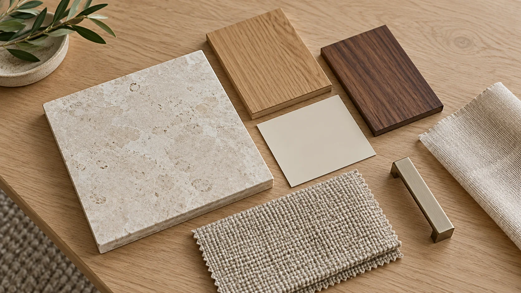
- View the combination in place. Put the samples beside the neighboring finishes. Look from the distance at which the wall or furniture will usually be seen, then move closer to inspect the texture. Repeat under the lighting you expect to use. A material board keeps the proposed combination together; our guide to color changes under different light explains another reason to review it in the room.
- Compare touch consistently. Run a hand over the intended contact area with similar movements on each sample. Separate roughness, drag, softness and cool or warm contact in your notes. “Looks warm, feels smooth and cool” is more useful than a single description such as “natural.” Give the person who will use the space a chance to make that judgment.
- Inspect the finished construction. Examine a faced or assembled sample, including the edge and any junction your hand will meet. A loose surface swatch gives you less information about the completed part. Look for a comfortable transition where a drawer front meets its edge or a wall panel meets its trim.
- Bring maintenance into the final comparison. Put the documented care method beside your touch notes. Keep a candidate when both suit the location. If you like its feel but cannot maintain it there, try it on a lower-contact or removable element instead.
Retain the chosen physical sample with its finish identification. It gives you a reference when the larger item arrives and helps you explain the intended tactile interior design to the person supplying or making it.
Where does silicone decorative film fit a tactile scheme?
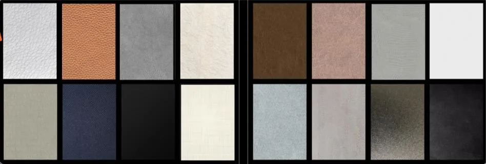
Puremorfilm makes decorative film with a silicone functional surface for flat, vertical furniture and wall finishes. An optional tactile layer is available. Texture and gloss can be customized.
Our silicone surface is inherently flame-retardant, with higher grades up to UL 94 V-0 available on request. In the manufacturer’s laboratory tests, coffee, red wine and soy sauce were left at 25°C for 24 hours and wiped off with no obvious change. We use a No DOP formulation.
We mainly supply rolls for PUR flat lamination, with laminated panels available on request. This paint-free material uses a silicone functional surface, distinct from PVC, melamine, PP and PETG decorative faces. With its leather-like feel and some elasticity, the film is unsuitable for floors, stovetop counters, shower floors and other walking surfaces. Free furniture film samples let you judge the proposed finish.
How do you choose a tactile scheme you can live with?
Keep the texture that feels right in its actual position and remains practical to maintain.
- Large surfaces: judge the color, pattern and light across the room.
- Frequent contact: put your hand on the actual finished face.
- Regular cleaning: retain the care method alongside the sample.
- Small movable accents: try the piece in place before committing to another fixed finish.
Tactile interior design becomes a workable choice when those judgments agree. Share the application position, desired feel, color or pattern, and likely contact and cleaning conditions when you contact us about a sample for your scheme.
Frequently Asked Questions
What is a tactile design?
A tactile design uses the feel of materials as part of the design decision. In interiors, that includes the texture, softness and contact sensation of the surfaces you encounter, alongside how they look.
What materials add the most texture to an interior?
Textiles, wood, stone, glass, ceramics and metals offer different forms of texture. A pronounced weave or relief is more visible, while smooth glass or metal can provide contrast beside it. The useful combination depends on the existing room.
How do you mix different textures in interior design?
Start with the main surface, then introduce contrasting materials in smaller areas. View the combination in the room and touch the surfaces you will handle. Keep the differences clear enough that each material contributes something you want.
How can you make a room feel tactile without making it look cluttered?
A small selection of distinct surfaces, with space around them, gives the room texture without filling every area. Work with the existing furniture and finishes before adding objects, and trial a removable accent beside them.
How does lighting affect texture in interior design?
Light direction changes the shadows and reflections that reveal a surface. Side lighting can emphasize raised details, while another angle makes them less apparent. Review the sample with the room’s intended lighting as well as by touch.