
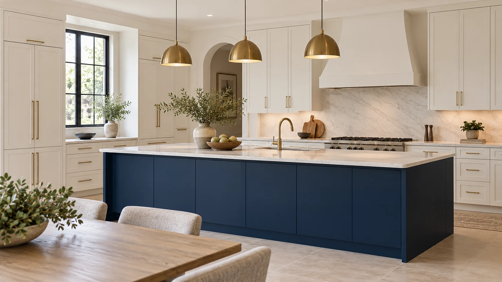
Two tone kitchen cabinets combine 2 colors or finish appearances across different cabinet groups. The clearest starting layouts are light uppers with darker or wood lowers, a contrasting island against a neutral perimeter, or one accent cabinet within an otherwise consistent run. Choose the layout before choosing the pair: a green island and green wall cabinets can give the same room quite different visual emphasis.
What are two-tone kitchen cabinets?
Two-tone cabinets use two distinct finishes within the kitchen, with each finish assigned to a recognizable group of cabinets. The contrast can come from color, visible woodgrain, sheen or a combination of these. White painted doors with a wood island qualify just as clearly as navy lowers with white uppers.
| Layout | Where the second finish goes | What to check in the room |
|---|---|---|
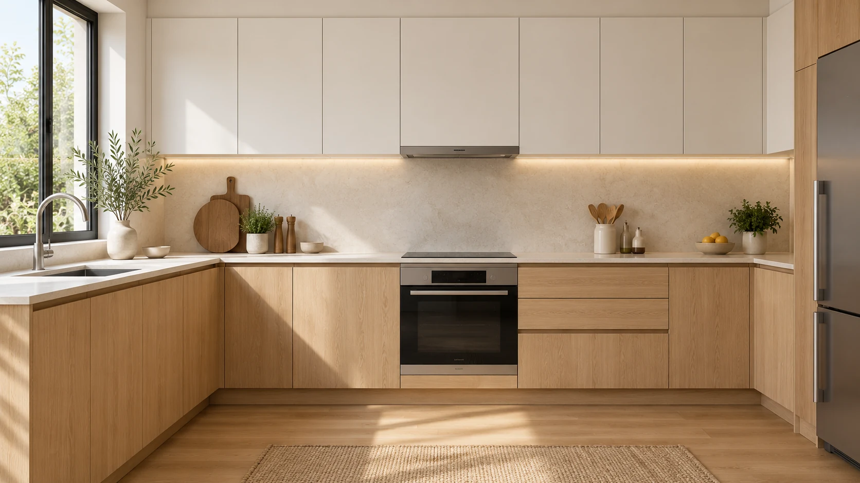
| Upper and lower split | Upper cabinets differ from base cabinets | Whether the tall cabinets belong with the upper or lower group |
| Island and perimeter | Island differs from cabinets around the walls | Whether the island should be the main focal point |
| Local accent | A pantry, coffee cabinet or short run changes finish | Whether that feature deserves attention from the main viewpoint |
Start with one of these arrangements. Adding a different finish to every cabinet group makes it harder to see which relationship holds the room together. The countertop, floor and backsplash already contribute color and pattern, even though they are outside the cabinet palette.
A color pairing also leaves the construction open. Painted wood, stained wood and decorative-faced panels create different surfaces. Our comparison of kitchen cabinet finishes explains those options when the appearance is settled and the material choice remains open.
Which two-tone color combinations work best?
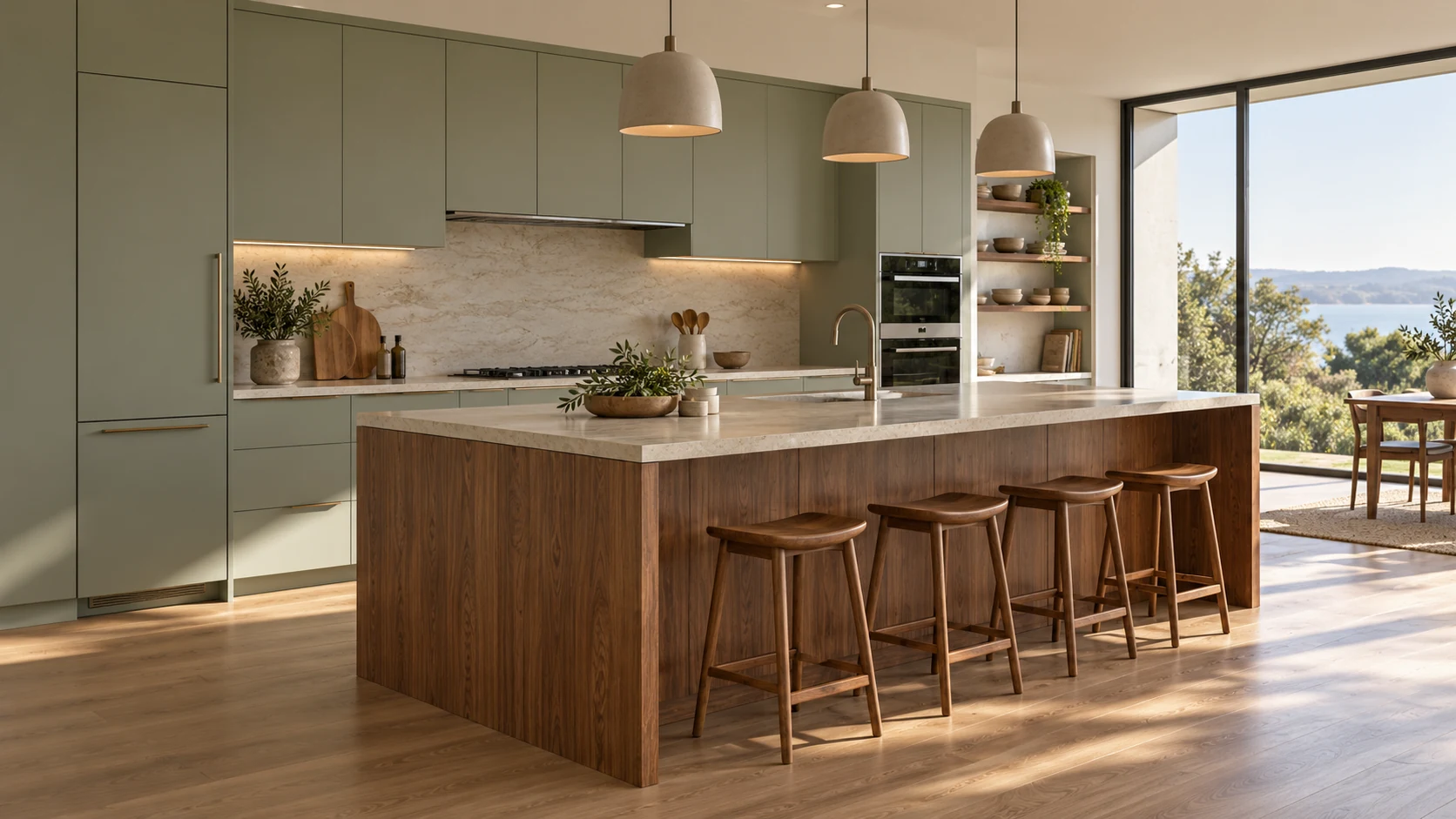
White with natural wood is a useful starting point for warmth, navy with white gives a clearer contrast, and sage with cream gives a softer color-led scheme. The right choice follows the existing floor and countertop as well as the amount of contrast you want.
| Pairing | Suggested placement | Design intention |
|---|---|---|
| Warm white and natural wood | White perimeter, wood island or lowers | Introduce grain while retaining a light main run |
| Navy and white | Navy island or base cabinets | Make the darker cabinet group stand out |
| Sage green and cream | Green lowers, cream uppers | Use color with a quieter contrast |
| Gray and charcoal | Lighter gray above, charcoal below | Keep both finishes within a restrained neutral palette |
| Dark wood and a light neutral | Dark wood on a selected group | Give the grain a stronger visual presence |
| Black and a light neutral | Black island or lowers, brass hardware | Create a pronounced contrast with a metallic detail |
Brass is the hardware in the last scheme; the lighter cabinet finish supplies the second cabinet color. A hardware finish can connect two cabinet groups without becoming another large area of color.
These are design starting points, with familiar variations described in this REALTOR kitchen feature. They are not a ranking of universally preferred kitchens. Keep the floor or countertop sample beside the pair while comparing alternatives. A cream that suits a warm floor may be less convincing beside a cooler fixed surface.
Where should each color go?
Lighter uppers with darker lowers provide a straightforward hierarchy, while a contrasting island concentrates the second color in one freestanding feature. Choose between those layouts by deciding what should attract attention when you enter the room.
In a kitchen with a prominent island, the island can carry the stronger color while the perimeter stays consistent. In a kitchen without an island, a base-cabinet contrast can establish the same clear division. A tall pantry needs an explicit assignment: carrying the darker lower finish up to the ceiling changes the composition considerably.
Treat “dark below, light above” as a design convention. It can make an overhead run feel less visually dominant, but it does not add floor area or prove that one color is more durable. A small kitchen can still use a dark upper cabinet if that is the intended effect. Compare the full elevation before deciding from a close photograph of a door.
Follow the color around visible ends and returns. An island’s side may occupy more of the view from the dining room than its working face does. Marking the intended finish on that side helps the finished kitchen follow the chosen layout, even when the doors are closed and viewed from another room.
Can you mix wood and painted cabinets?
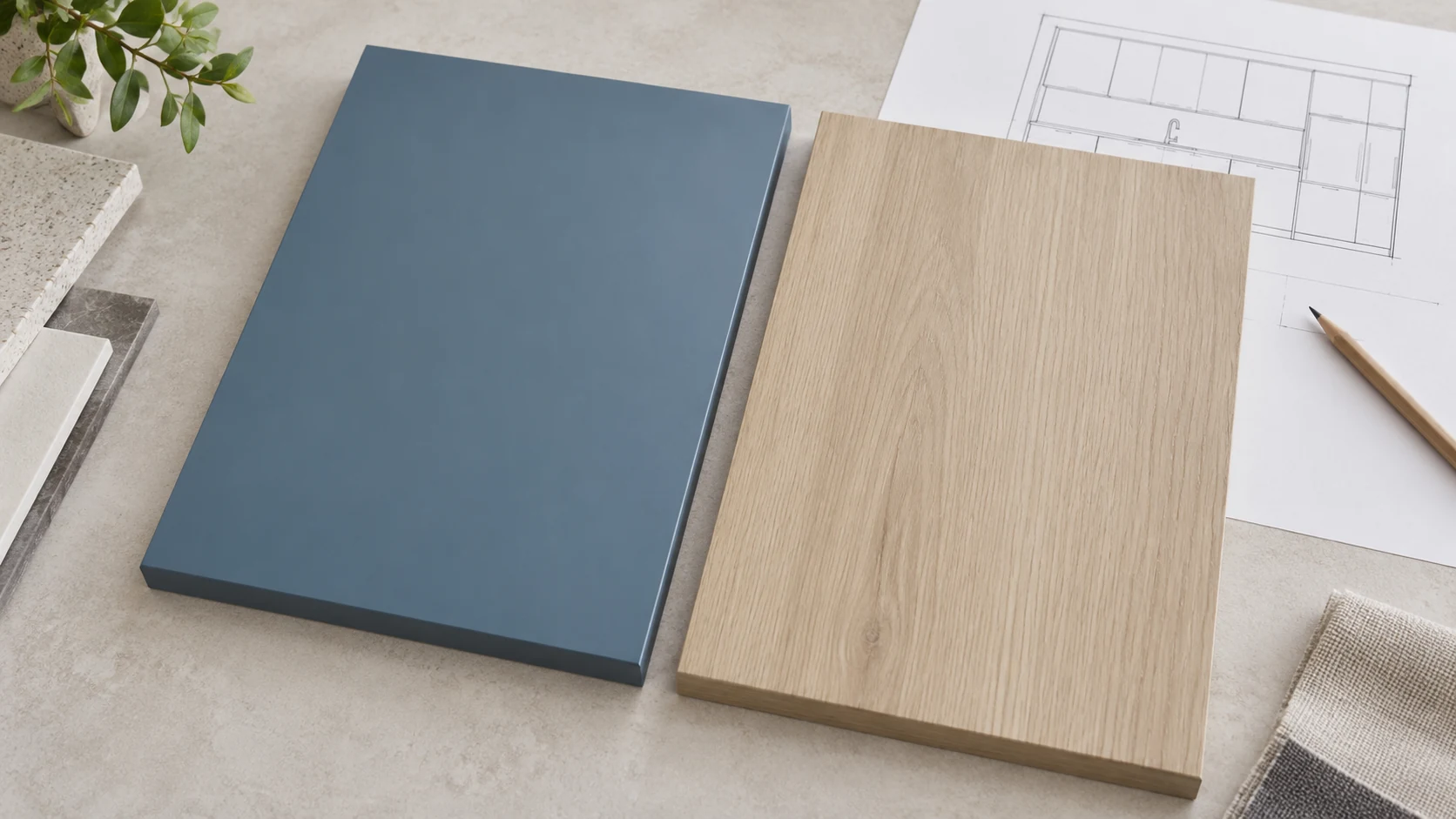
Yes, wood and painted cabinets can form a coherent two-tone scheme when the wood’s color and pattern suit the neighboring solid finish. A wood island with a painted perimeter is an easy arrangement to compare because the two materials occupy distinct groups.
Look beyond the species name. A pale wood sample with a yellow cast, a more neutral sample and a darker brown sample will establish different relationships with the same white. Put the actual candidate faces together. The sample you liked individually may be the one that introduces an unwanted contrast once paired.
Decide how much grain you want to see, too. A strongly figured island already supplies pattern; a quieter countertop can leave that pattern visible. With a busy countertop, a less assertive grain may be easier to coordinate. These are visual choices, so compare alternatives in the actual composition instead of treating a species label as the answer.
The wood appearance can come from different material routes. Laminate cabinets and wood cabinets differ in construction and finish options even when their colors are similar. Choose the appearance first, then compare the real door samples that could deliver it. Showing a woodgrain image does not specify a stained-wood door.
Why does a color look different next to its partner?
A neighboring color can change how you perceive the same sample, even while the lighting stays fixed. This effect is called simultaneous contrast. The NCS color-contrast teaching materials demonstrate changes in perceived lightness and hue or nuance when the background changes.
Try a controlled comparison before asking for a different pale finish. Keep the light, viewing position and pale sample unchanged. Place that same sample beside a candidate dark wood, then beside a candidate deep green. Look at the pale sample each time. Note whether it reads lighter, darker, warmer or cooler beside each neighbor, and by how much.
Then review the pair using actual door-face samples in the intended arrangement. This is a practical application of the color-context effect, not a kitchen test published by NCS. It helps you identify what changed during the comparison: the neighboring finish, the light or the specimen itself.
When the match changes after moving to another light source, our metamerism and color guide addresses that additional problem. Keep the light fixed during the neighbor comparison so the two effects are easier to examine.

How do you know a two-tone scheme works?
A useful review asks three different questions: whether you like the whole pair, whether it feels as coordinated as you want, and whether you like the focal color against its background. An island can stand out successfully while the complete scheme still loses to another pairing you prefer.
This distinction comes from Schloss and Palmer’s 2011 color-combination research, which studied preference, harmony and preference for a figure against its background as different judgments. The experiments showed small colored squares within larger squares on a computer display, not furnished kitchens. The following review is our application of that distinction to a design choice.
First, compare the complete schemes and ask which one you prefer living with. Keep the layouts comparable so an attractive rendering does not settle a color question through different styling. Then ask whether each scheme has the degree of coordination you want. A quiet kitchen and a deliberately contrasting kitchen have different goals.
Finally, look at the intended focal group. Does the island stand out enough, and do you still want that much attention on it? A striking island might be exactly right. It might also compete with a stone feature or a view you wanted to emphasize instead.
Write a short reason for your choice. “I prefer the whole room with the softer green” communicates a different decision from “the darker island is more dramatic.” Neither statement needs a universal winning color pair.
How do countertops, hardware, lighting and sheen tie it together?
Countertops and backsplashes connect the two cabinet finishes visually, while hardware and sheen adjust how strongly the cabinet groups relate. Bring those surfaces into the comparison before committing to a pair chosen from isolated swatches.
A pale countertop can bridge a dark island and light perimeter. A patterned backsplash can introduce colors already present in both cabinet finishes. If the stone or tile has a dominant pattern, give it room in the composition; adding equally strong cabinet grain and highly contrasting colors may produce a busier result than intended.
Hardware can match across the kitchen or vary between cabinet groups. Repeating the same pull shape is one way to maintain a relationship while changing its finish. Using the same finish throughout gives a more direct connection. Compare the handle on each real face, since a small metal sample on a desk is easy to overlook.
Sheen contributes another contrast. Our matte versus gloss cabinet comparison explains the visual options; ultra matte versus soft touch separates low reflection from the surface’s tactile character. Choose a sheen for its actual appearance and documented care requirements. A fashionable finish name supplies neither a cleaning result nor a fingerprint test.
View the final assembly under the daylight and electric lighting you will use. If you change the countertop or hardware after choosing the pair, review the composition again with that replacement present.
Where does a silicone-faced film fit in a two-tone kitchen?
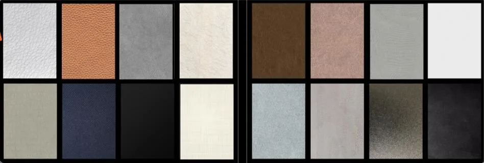
Puremorfilm makes furniture decorative film with a silicone functional surface for flat cabinet faces, including woodgrain and solid-color appearances. Our selection has more than 100 patterns, and texture and gloss can be customized for a paired scheme. Review the available patterns and finishes together; our woodgrain decorative film provides another starting point for the wood side of the pair.
Our silicone surface is inherently flame-retardant, with higher grades up to UL 94 V-0 available on request. In the manufacturer’s laboratory tests, coffee, red wine and soy sauce held at 25°C for 24 hours left no obvious change after wiping. We use a No DOP formulation. These are film-level statements, with the stain observation limited to those laboratory conditions.
We mainly supply rolls for PUR flat lamination, with faced panels available on request. Our paint-free decorative material uses a silicone functional face, a different surface route from PVC, melamine, PP and PETG decorative faces. A flat door-face scheme fits this route; a shaped, wrapped profile needs another construction.
How do you choose your two-tone cabinet colors?
Choose the layout, compare the actual pair in context, then confirm that the complete room meets your intended visual goal. A simple sequence keeps an attractive individual sample from deciding the whole kitchen prematurely.
| Decision | What to do before moving on |
|---|---|
| Establish the layout | Assign the second finish to uppers, lowers, island or one accent group |
| Choose the pair | Compare it with the fixed floor and countertop |
| Examine the color relationship | Keep the light fixed and change the neighboring sample |
| Judge the composition | Review whole-pair preference, coordination and focal emphasis |
| Confirm the material | Review real door faces and the visible ends in the chosen arrangement |
Keep a photograph or marked elevation showing where each finish belongs. For a replacement-door project, match that appearance decision to the actual cabinet materials, door construction and retained cabinet parts. We can help review suitable film appearances against the pair you are considering.
Bring the kitchen plan or photos, your two preferred colors or wood tones and the door style when you contact us.
Frequently Asked Questions
Are two toned kitchens still in style?
Yes, two-tone schemes remain part of current kitchen design, including wood with painted finishes and contrasting islands. Choose a pairing that suits the fixed surfaces and the room’s intended emphasis; popularity cannot guarantee how long you will like a particular color.
Which color is best for kitchen cabinets?
A warm neutral or a wood appearance is a useful main finish when you want the second cabinet group to provide the stronger contrast. A more colorful main run also works when that color is the starting point for the whole room.
What color not to paint kitchen cabinets?
A color that conflicts with the countertop, floor or other retained finishes is the one to reject in your scheme. There is no absolute banned shade. Compare the proposed color in context before ruling it in or out by name.
What mistakes should you avoid with two-tone cabinets?
Too many competing cabinet groups, an unassigned tall cabinet and choosing each color in isolation can undermine the intended layout. Another mistake is approving the island’s drama without deciding whether you prefer the complete pair.
Should hardware match on two-tone cabinets?
No, hardware can vary between the two cabinet groups. A repeated shape or finish can provide a connection, while deliberately different hardware can reinforce the division. Compare both choices on the actual cabinet faces.