
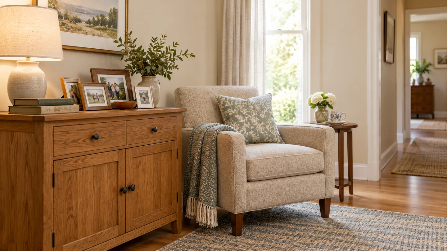
Senior living interior finishes work best when they feel familiar and remain practical: wood tones, textures and colors chosen by the resident, restrained glare, visible contrast at important features and easy-wipe faces in kitchens and bathrooms. Where ADA technical provisions apply, an accessible route generally needs at least 36 inches of clear width, so furniture and finishes should be planned together.
Begin with what the resident wants to keep. A favorite chair, family photographs and a familiar wood finish can guide the new room more usefully than a trend board. Then examine how each surface looks under the actual lights, how it will be cleaned and where it meets the route through the room.
What interior finishes work best in senior living?
Resident-chosen colors, familiar wood and natural textures, low-glare broad surfaces and cleanable faces in frequently used areas are useful starting choices. Apply contrast to features people need to find, such as doors and handrails, while respecting the individual’s preferences and needs.
The design aim is a usable home. A living room can have a warm cabinet front and soft textiles, while a kitchen needs a face that can be wiped after ordinary spills. These are different surface jobs within the same apartment.
| Location | Finish direction | What it helps you assess |
|---|---|---|
| Living and bedroom walls | A resident’s chosen palette with manageable sheen | Familiarity, artwork and appearance in room lighting |
| Cabinet doors | Protected, easy-wipe decorative faces | Contact around handles and routine care |
| Doors, trim and handrails | Visible contrast with adjacent surfaces | Recognition of important features |
| Kitchen and bathroom splash areas | Suitable smooth panels or tile assemblies | Water exposure, joints and cleaning |
| Shared corridors | Maintainable wall finish with clear handrail and doorway contrast | Everyday contact and visual orientation |
The Alzheimer’s Society environment checklist includes contrast, lighting and glare advice for dementia-friendly settings. It is a UK charity’s guidance for people living with dementia, not a U.S. requirement, and it does not assume every older resident has the same visual or cognitive needs. The commercial interior application areas show where decorative panel facings enter the broader room design.
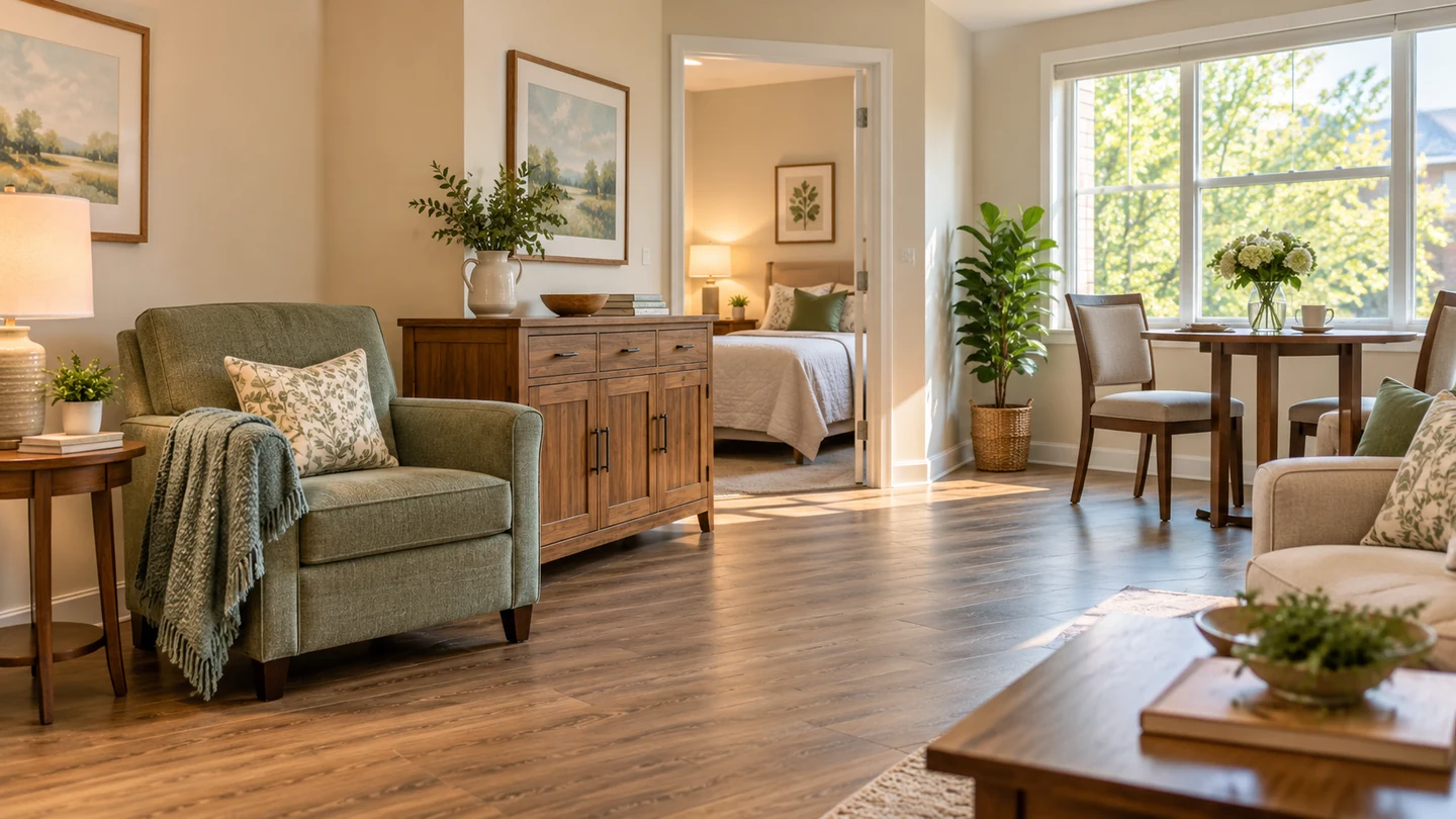
How do you blend existing furniture with new finishes?
Choose the furniture and meaningful objects that will stay, then compare new wall and cabinet samples beside them under the room’s light. Repeat a few compatible colors or wood tones so new and retained pieces sit comfortably together.
The senior-apartment decorating guidance starts with practical planning and personalization. Measure the pieces as well as choosing their appearance. A familiar table can be worth keeping, but its position needs to fit the smaller room and the routes used every day.
For a cabinet beside an existing oak dresser, compare a useful-size sample with the dresser instead of picking from a small online photograph. Look at the combination by day and with the apartment’s evening lights on. A slightly different wood tone can look deliberate when the wall color brings them together; an attempted near match can make a small mismatch more obvious.
Give photographs or a few keepsakes a defined display area. That keeps them visible while leaving everyday surfaces and routes easier to use. Plan the wall finish around the actual display and the community’s rules for fixing items, without turning every free surface into storage.
Which finish styles and palettes suit these spaces?
Warm neutrals and wood tones are common starting palettes, but a resident may prefer classic, contemporary or coastal colors. Use the preferred style as a direction, then adjust contrast and sheen for the room and its occupant.
Three examples in Studio 121’s November 2024 project discussion show the range: warm stone and antiques for a restrained classic interior; veneer, metal, sea blue and copper for a transitional setting; and sand colors, sea blue and wood for a coastal scheme. These are the design practice’s projects, illustrating alternatives to one standard institutional palette.
In an apartment, the same principle can be modest: a familiar wood cabinet against a chosen wall color, or a coastal accent repeated in curtains and artwork. The resident’s own taste should remain visible. Color choices here describe appearance, without promising a therapeutic effect.
For wall detail, compare the paneling ideas with the simpler decorating routes in wallpaper versus paint. A quiet broad surface can support a few personal focal points, while a busy pattern needs consideration alongside the person’s visual perception and the room’s other objects.
How do contrast, glare and lighting change the choice?
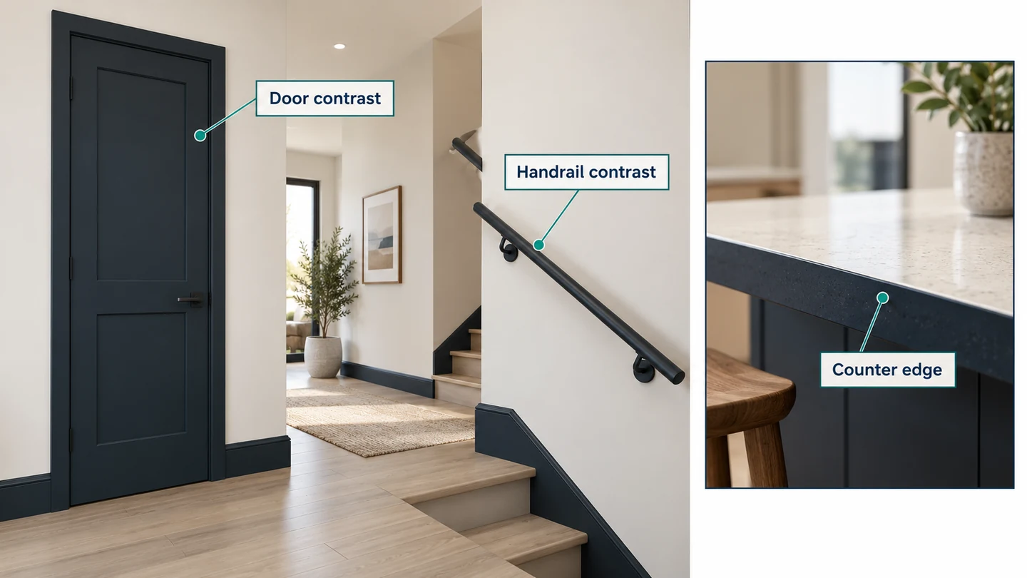
Use clear contrast at features the person needs to locate, reduce distracting reflections on broad faces and examine samples in even, useful lighting. Contrast at a doorway or handrail serves a different purpose from an all-over decorative pattern.
The dementia-friendly checklist recommends clear signs against their backgrounds, avoiding glare and deep shadows, and a contrasting toilet seat. Highly reflective floors and bold carpet patterns can cause perceptual difficulty for some people with dementia. These considerations address particular visual needs; each resident can prefer a different appearance.
The guidance on changes in perception discusses confusing reflections in mirrors or windows and reducing visual clutter. In practice, look at a proposed glossy cabinet from the chair or bed position as well as standing directly in front of it. A bright reflected lamp can be conspicuous from one position and absent from another.
Contrasting door trim, handrails and switches can make those features easier to distinguish from the wall. The same idea applies to a countertop edge that needs to stand out from the cabinet below. The matte and gloss cabinet comparison explains the appearance and maintenance tradeoffs; select the sheen for the actual room and resident; matte is a finish choice, not a medical intervention.
How much clear space should furniture leave?
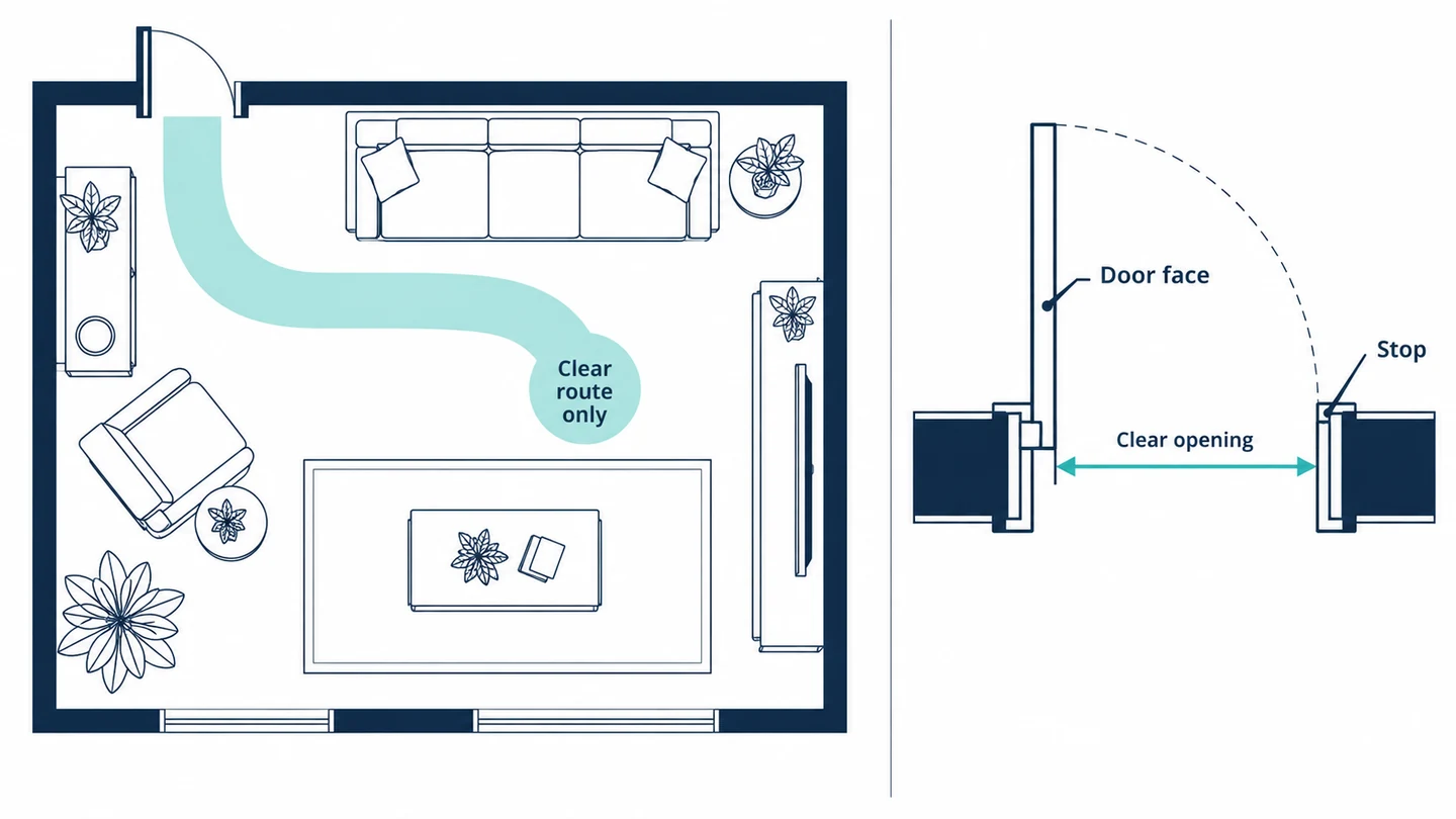
Measure the room and furniture, then protect the routes the resident actually uses. Where the relevant ADA technical provisions apply, distinguish the accessible-route dimensions from the clear opening through a door.
The Access Board route guide explains section 403.5.1, while the technical provisions for doors include section 404.2.3. These figures describe those applicable provisions, with project-specific scoping still needed for residential spaces and alterations.
| Feature | Technical dimension | How to read it |
|---|---|---|
| Accessible route | Generally at least 36 inches clear | Measure the usable route past furniture and fixed objects |
| Permitted short narrowing | 32 inches minimum for a length no greater than 24 inches | Successive narrowed portions need intervening segments at least 48 inches long and 36 inches wide |
| Door clear opening | At least 32 inches | For a swinging door, measure between the open door face and stop with the leaf at 90° |
| Opening deeper than 24 inches | At least 36 inches clear | Depth changes the clear-width requirement |
A nominal door size and its usable clear opening are different measurements. Likewise, a generous room can have a restricted path when a chair, cabinet or open drawer occupies the route. Mark the proposed furniture positions before ordering large pieces, and include any thickness added by a new wall detail.
For a smaller apartment, that can mean retaining a favorite chair and choosing a narrower cabinet instead of filling both sides of the route. Treat the table as planning dimensions; the project’s accessibility review decides what applies.
Which kitchen and bathroom finishes are easiest to clean?
Smooth, protected faces with few dirt-trapping crevices are useful for cabinet doors, splash walls and work surfaces. Suitable laminate or film-faced doors, tile or wall-panel assemblies and easy-wipe worktops can meet that aim when matched to the actual location.
At a cabinet handle, compare how easily an ordinary mark can be removed using the finish’s permitted routine. Around a basin, inspect the edge and joint details as well as the broad face. A cleanable finish over an exposed, moisture-vulnerable edge leaves part of the practical problem unresolved.
Deeper texture may take more effort to wipe, while a protected smooth face gives the cloth a simpler surface to follow. Assess the actual sample and its care instructions, without assuming every laminate, tile or film tolerates every cleaner. The person or team doing the cleaning should be able to use the approved method comfortably.
The cabinet cleaning guide covers routine care for different faces. The bathroom panels and tiles comparison discusses wet-area options. In a shower, select the complete wet-area assembly and its junctions; a wipeable face alone leaves waterproofing design to be addressed.
What finishes suit shared corridors and dining rooms?
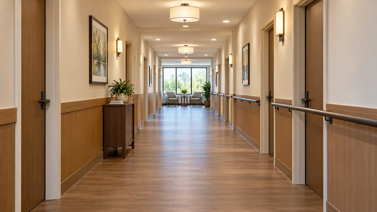
Shared corridors need maintainable faces at contact height and clear contrast around handrails and doors; dining rooms can pair easy-clean table and wall surfaces with warm tones and comfortable lighting. Keep the design recognizably domestic while planning for shared use.
In a corridor, consider where carts, bags and hands meet the wall. A repairable or replaceable protected section can be more practical than a delicate decorative surface throughout. Look at the transition around door frames and rail fixings so those features remain visible and the edges can be cleaned.
For dining rooms, compare the table face and edge under both daylight and the installed lighting. Wood tones can give warmth without requiring every surface to be natural timber. Maintainable wall-panel finishes offer another option for frequently used interiors, with the actual senior community’s needs guiding the choice.
A common palette can connect public areas to apartments without making all rooms identical. Use residents’ preferences and familiar furnishings where possible, and review any strong pattern or reflection against the needs of the people using that space. The same attractive finish may work differently at eye level, beside a window or along a long corridor.
How should changes be planned in an occupied community?
Get the community’s approval before changing apartment finishes, and coordinate larger work in stages with clear notice, access arrangements and control of noise and odors. Changes are often possible within community rules, so establish the permitted scope before purchasing materials.
For a resident’s room, ask about wall color, fixing pictures, lighting and any work that affects the building fabric. Keep a record of the approved finish and the agreed work area. That helps a small personalization project stay aligned with building management and later maintenance.
For a shared corridor, plan how residents reach their rooms and normal destinations while a section is being worked on. Discuss timing with the people responsible for the community’s daily operation, and explain changes before they happen. A phased programme is a planning choice, without a promise of zero disturbance or a fixed one-day completion.
New finishes also need their stated curing, airing and cleaning arrangements. The furniture off-gassing article explains why a material or coating statement should be read in context. Choose products and work methods using the project requirements, instead of inferring whole-room air quality from a claim about one film or coating.
Where does a silicone-faced panel film fit?
Puremorfilm makes decorative film with a silicone functional face for flat cabinet and wall panels, offering more than 100 designs with texture and gloss customizable on request. We supply mainly rolls for PUR flat lamination, with film-faced panels available on request. The silicone face is inherently flame-retardant; higher grades up to UL 94 V-0 are available on request.
In the manufacturer’s laboratory tests, stated stains held at 25°C for 24 hours wiped away with no obvious change. Our formulation is No DOP. Our newer paint-free facing uses silicone functionality, distinct from PVC, melamine, PP and PETG surfaces. The film is not suitable for floors, stovetop counters or shower floors.
See the wood-grain decorative film route for a cabinet or wall-panel face alongside the other finishes in a room.

Which finishes fit each room?
Choose for the person, location and daily routine: familiar appearance in living areas, easy care around water and clear contrast at important shared features. Compare real samples beside retained furnishings before finalizing the palette.
| Room | Useful finish direction |
|---|---|
| Living room | Resident-chosen colors and familiar textures around retained furniture |
| Bedroom | A calm preferred palette, controlled reflections and a clear route |
| Kitchen | Protected cabinet faces, cleanable edges and a suitable worktop |
| Bathroom | Water-appropriate assembly with visible useful features and maintainable joints |
| Shared corridor | Maintainable contact-height faces and contrasting rails and doors |
| Dining room | Easy-clean table and wall finishes in a warm coordinated setting |
For a flat-panel decorative facing, contact us with the cabinet or wall-panel use and the wood grain or color you want to explore.
Frequently Asked Questions
How do you make a senior-living apartment feel like home?
Keep a few meaningful furniture pieces and photographs, then coordinate new surfaces with the resident’s preferred colors and familiar textures. Measure the room so the retained pieces leave useful routes and usable everyday surfaces.
Can you paint or change finishes in a senior-living apartment?
Yes, changes are often possible when the community approves them and its rules allow the proposed work. Establish the permitted materials, colors and installation arrangements before starting.
How can you personalize a smaller apartment without clutter?
A few selected objects in a defined display area, useful furniture and clear everyday routes make personalization manageable. Choose the pieces that matter most instead of filling every available surface.
How wide should doorways be in senior living?
The applicable ADA door provision requires at least 32 inches of clear opening, with a wider clear opening for the deeper condition described above. Measure the usable opening rather than relying on the nominal leaf size, and establish which provisions apply to the project.
What colors should you choose for a senior living room?
The resident’s preferred warm neutrals, wood tones or other familiar colors are good starting choices. Use contrast where important features need to be distinguished, and consider individual glare and perception needs without claiming a therapeutic color scheme.